Where \(\alpha\) is the level of (\(Y\)) at \(x=0\) and \(\beta\) is the slope of the line.
Each of these two parameters consumes one degree of freedom.
18.2.2 Hypotheses
The natural hypothesis is to check whether (\(X\)) has an effect on (\(Y\)), that is: \(H_0: \beta=0\) with the alternative \(H_A: \beta \neq 0\). This can be tested with either an F-test or a T-test (yielding the same results). For some applications the intercept (\(\alpha\)) might be related to a question, just as other values for \(\beta\) could be relevant to test, but the most common is testing the relation between \(X\) and \(Y\).
18.2.3 Estimation
The model is done by least squares fit, which is explained in detail elsewhere in these notes.
Utilizing the summary statistics on \(X\) and \(Y\):
\(\bar{X} = \sum(X) / n\)
\(\bar{Y} = \sum(Y) / n\)
\(\sum(X - \bar{X})(Y - \bar{Y})\)
var\((X) = \sum(X - \bar{X})^2 / (n-1)\)
The parameters of the model: slope (\(\beta\)), intercept (\(\alpha\)) and the residual variance (\(\sigma^2\)) are estimated as follows.
A combination of the estimates and uncertainties can be used for calculating confidence intervals via the general formula as a symmetric range on each side of the estimate.
Confidence interval for any (central) parameter (\(\alpha, \beta, \mu\)… here we use \(\beta\)) have the usual form:
where the subscript \((1-\alpha)\) refers to the coverage of the interval. Usually \(\alpha = 0.05\) giving \(95\%\) coverage of the interval with a corresponding \(1-\alpha/2 = 0.975\) level for the \(t-\)fractile.
18.2.5 Confidence- and prediction intervals for the line
Confidence bounds around the line can be calculated for each value of \(X\). For a single point \(X^*\) the formula is as follows:
Given a single new sample with a known \(X^*\), one might want to estimate the associated (unknown) \(Y\) including an interval indicating the uncertainty. This is called a prediction interval and has the following form:
The prediction- and confidence interval have a very similar form. The only difference is the \(1\) in the \(\sqrt{}\) in the calculation of the standard error. This \(1\) can be seen as (one over) the number samples for which the interval is calculated: For prediction it is \(\frac{1}{1} = 1\) whereas for confidence it assumes an infinitely large population \(\frac{1}{\inf} = 0\).
18.2.6 Model assumptions
Similarly to other types of ANOVA models, regression models assumes independent residuals with the same variance, why regression model should be exposed to the same procedures for model validation.
18.2.7 Transformations
The model assumes a linear relation between \(X\) and \(Y\). However, inspection of data or mechanistic insight might reveal, that this relation is suboptimal, why the response and/or the descriptor variable might be subjected to a relevant transformation. This is investigated and checked by visual plotting of the raw and transformed data.
18.3 Videos
Linear Regression, Clearly Explained - StatQuest
Using Linear Models for t-tests and ANOVA, Clearly Explained - StatQuest
18.4 Exercises
Exercise 18.1
Exercise 18.1 - Linear regression
To get a feeling of how linear regression works we can consider two variables, \(x\) and \(y\), that are linearly dependent. We generate \(x\) as a random variable and \(y\) is related to \(x\) plus some noise.
# Generate 20 normally distributed data points (mean = 0, sd = 1)x <-rnorm(20) # Add a slope (m = 2) and normally distributed noise (mean = 0, sd = 1)y <-2* x *+rnorm(20) # Convert to dataframedf <-data.frame(x, y)# Create plotplt <-ggplot(df, aes(x, y)) +geom_point() +geom_abline(slope =1, intercept =0) # Add straight line# Show plotplt
Tasks
Change the slope and intercept of geom_abline() to get the line to fit the data as well as possible.
Add a line estimated by least squares (see code below). Does the manually estimated line fit with the regression line?
# Add regression lineplt <- plt +geom_smooth(method ="lm", se = F, color ="red")# Show plotplt
From the data generation step above we can see that the true relationship is slope = 2 and intercept = 0. Add a line reflecting the thr
Tasks
Add a line reflecting the true relationship of \(x\) and \(y\).
Is the estimated line the same as your new line (the truth)? Why/why not? Try to run the script a couple of times.
How does the least squares line relate to the true relationship line?
Exercise 18.2
Exercise 18.2 - Diet and fat metabolism - regression by hand
The diet is a central factor involved in general health, and especially in relation to obesity, where a balance between intake of protein, fat and carbohydrates, as well as type of these nutrients seems important. Therefore various controlled studies are conducted to show the effect of different diets. A study examining the effect of protein from milk (casein or whey) and amount of fat on growth biomarkers of fat metabolism and type I diabetes was conducted in 40 mouse over an intervention period of 14 weeks.
The data for this exercise is the same as for Exercise 10.3.
For this exercise we are going to focus on predicting different biomarkers from weight data.
Tasks
Set the independent variable (\(X\)) to be weight at 14 weeks (measured in grams), and let the dependent variable (\(Y\)) be the cholesterol level. Write up the model for the relation between \(X\) and \(Y\).
Make a small drawing, and infer all the model parameters on this figure.
Estimate the parameters based on the descriptive numbers in the table below.
Table 18.1: Some descriptive numbers computed on the data.
\(\sum{X}\)
\(\sum{(X - \bar{X})^2}\)
\(\sum{Y}\)
\(\sum{(Y - \bar{Y})^2}\)
\(\sum{(X - \bar{X})(Y - \bar{Y})}\)
\(\sum{(Y - \hat{Y})^2}\)
1426.2
1099.3
156.5
18.99
116.44
6.65
Tasks
Construct confidence intervals for the intercept and the slope for this model, and judge whether there seem to be a relation between weight and cholesterol level.
Hint: Chapter 5.4 in Brockhoff have formulas for the variance of the parameters.
Calculate a prediction interval for a new mouse with a weight of 40g
Hint: Box 5.17 in Brockhoff have the relevant formulas.
Load data, plot it, and verify the results using aov() for construction of a regression model, and predict() for the prediction of new samples.
Exercise 18.3
Exercise 18.3 - Diet and fat metabolism - regression and PCA
Make regression models between weight at week 14 and all 7 biomarkers. That includes: Scatter plot, regression modeling and check of model assumptions.
For the response variable insulin, there are 3 outlying points. Is the results robust towards removal of those?
Make a PCA on the biomarkers and plot it using ggbiplot().
Infer the external information $bw_w14 on the plot using geom_point(aes(color = ...)). If you are not satisfied with the colors, then use scale_color_gradient(low=-..., high=...) to modify it.
Extract the first couple of components and use those as response variables in regression models versus weight.
Compile the results, and give an answer to which pattern of biomarkers that are related to weight.
Exercise 18.4
Exercise 18.4 - Standard addition
This exercise shows how regression modeling is used for calculating the concentration of a chemical substance in a sample.
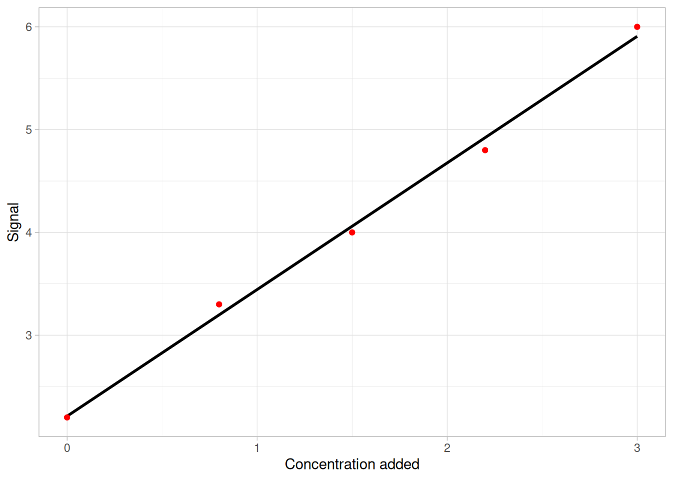
The setup is: We have a sample with a molecule of unknown concentration (\(C\)). We have an indirect technique which gives a response (\(y\)) proportional to the concentration of this molecule. That is \(y \propto C\) or \(y = \alpha C\). However, we do not know the coefficient \(\alpha\). In order to determine this, a series of five measurements with added volume of the molecule is conducted. Schematically that results in measurements like in figure 18.1. Due to proportionality then the concentration in the sample is simply the value where the line crosses the \(x\)-axis.
Figure 18.1: Principle in standard addition. Sample concentration is read off in the point where the line crosses the x-axis.
In table 18.2 are listed five measurements from a standard addition experiment.
Table 18.2: Standard addition vs signal for a calibration set.
1
2
3
4
5
Concentration added (\(x\))
0.0
0.8
1.5
2.2
3.0
Signal (\(y\))
2.2
3.3
4.0
4.8
6.0
Tasks
Chuck the data into R.
Make a scatter plot, and add a straight line indicating the best fit.
If you use ggplot2 then adding + geom_smooth(method = 'lm', fullrange = T) to the plot will do it.
State a statistical model between \(y\) and \(x\), and fit it using either aov() or lm().
Based on the model parameters (slope and intercept) derive an expression for \(-x_{y=0}\).
Based on the estimated model, estimate the concentration in the sample.
It should be quite easy to give a central estimate for the concentration. However, giving a confidence interval for this measure is not so easy. In order to do so, confidence limits for the estimated line is used to assess the bounds of the confidence interval.
Tasks
Construct confidence intervals for a broad range of \(x\)-values. This is done by constructing a new data frame and predicting responses for this using the estimated model (see code below).
Use the upper, central and lower limits of this series of x-values to estimate the limits for \(-x_{y=0}\).
# Load in datadf <-data.frame(conc =c(0.0, 0.8, 1.5, 2.2, 3.0),sig =c(2.2, 3.3, 4.0, 4.8, 6.0) )# Fit linear modelfit <-lm(sig ~ conc, data = df)# Create data for predictionnew_data <-data.frame(conc =seq(-3, 7, length.out =1000))# Predict data using fitted lmsig_pred <-predict(fit, new_data, interval ="confidence")sig_pred[ , 1] # Fitted valuessig_pred[ , 2] # Lower CIsig_pred[ , 3] # Upper CI
Exercise 18.5
Exercise 18.5 - Standard curve for calcium in milk - hand calculations using R
Milk coagulation is needed during cheese making. A number of factors influence the coagulation properties of milk. Obviously \(\kappa\)-casein is important. However, also the amount of calcium (Ca\(^{2+}\)) is essential during milk coagulation.
Calcium in a milk sample may be quantified by atom absorption spectroscopy. This technique relies on Beer’s law:
\[
A = \varepsilon \times L \times C
\]
Where \(A\) is the absorbance, \(\varepsilon\) is the molar absorptivity (constant), \(L\) is the path length of the sample (constant) and \(C\) is the concentration. Hence, Beer’s law reveals proportionality between absorbance and concentration.
In this exercise we determine the concentration of Ca\(^{2+}\) from a standard curve. Five standard solutions with known Ca\(^{2+}\) concentrations were prepared and the absorbance for each sample was measured (table 18.3).
Table 18.3: Measured absorbance of standard solutions.
Ca\(^{2+}\) (ppm)
Absorbance at 422.7 nm
0.0
0.000
2.0
0.063
5.0
0.141
8.0
0.218
10.0
0.265
Use the following code to get the data into Rstudio and plot the data. We want to find the relationship between concentration of Ca\(^{2+}\) and Absorbance. This is a linear model: \(y = b + ax + e\)
In this case we control the concentration of Ca\(^{2+}\) and we measure the absorbance. Hence, in the linear model \(y\) is the absorbance and \(x\) is the concentration of Ca\(^{2+}\). Here, \(e\) is the part of the variation not captured by the model.
Calculate slope and offset of the straight line (the standard curve) that best describes the relationship between Ca\(^{2+}\) and absorbance. Add it to the plot as a straight line.
And the offset, \(b\) is estimated by \[
\hat{b} = \bar{y}-\hat{a}\bar{x}
\]
Here is some R-code to help you.
x <- df$calciumy <- df$absmx <-mean(x)my <-mean(y)Sxx <-sum((x - mx)^2)
Tasks
Test for proportionality, i.e. no offset (\(b = 0\)). First calculate a confidence interval around your offset. Then state the null hypothesis and the alternative hypothesis. Test the null hypothesis. Does the t-test result correspond with the confidence interval?
Here is some code to help you
n <-5# number of standard solutionse <- y - (a * x + b) # model error
Tasks
Three new milk samples with unknown concentration of Ca\(^{2+}\) were measured with atom absorption spectroscopy. Use the standard curve to quantify the concentrations of Ca\(^{2+}\) in the new samples. The absorbance values for the three new samples are found in table 18.4.
Table 18.4: Absorbances for samples with unknown Ca\(^{2+}\) concentration.
Sample
Absorbance at 422.7 nm
Ca\(^{2+}\) (ppm)
U1
0.101
U2
0.147
U3
0.243
Use the following code to get the unknown samples into R and add the samples to the standard curve.
# Add you estimated concentrations hereestimated_conc <-c(1, 2, 3)# Create dataframe with unkown samplesdf_new <-data.frame(sample =c("U1", "U2", "U3"),calcium = estimated_conc,abs =c(0.101, .0147, 0.243))# Add new samples to plotplt <- plt +geom_point(data = df_new, aes(calcium, abs), color ="red") +geom_text(data = df_new, aes(label = sample), nudge_x =-.3)
In order to get the confidence interval for these estimates, we need to calculate the confidence limits for the estimated regression line.
Tasks
Calculate confidence bounds for a sequence of \(x\)-values (concentrations). Add the confidence bounds to the plot.
Here is some code to help you:
# Create a sequence of 1000 x valuesx <-seq(0, 10, length.out =1000)# Combine data into data frame.df_conf <-data.frame(calcium = x,lower = a * x + b ..., # Add equation for CI hereupper = a * x + b ..., # Add equation for CI here)# Add CI to plotplt <- plt +geom_line(data = df_conf, aes(calcium, lower), color ="blue") +geom_line(data = df_conf, aes(calcium, upper), color ="blue")
Tasks
Find the confidence interval limits (upper and lower) for each prediction of the new samples (U1, U2, U3).
Here is some code to help you:
# Initiate vectors to store data inupper <-c()lower <-c()for (i in1:3) {# Find the x-values where the absolute difference is smallest lower[i] <- x[which.min(abs(df_conf$lower - df_new$abs[i]))] upper[i] <- x[which.min(abs(df_conf$upper - df_new$abs[i]))]}# Add to data framedf_new$lower_ci <- lowerdf_new$upper_ci <- upper
Tasks
Have a look at the widths of the confidence intervals (lower to upper) for each estimated concentration of Ca\(^{2+}\) (the three new samples).
Are the confidence intervals having the same widths? Why/why not?
Exercise 18.6
Exercise 18.6 - Standard curve - quantification of phenol content in spice extracts
Oxidation of foodstuff is one of the main reasons leading to decreased quality. During lipid oxidation, lipid radicals are formed, which will increase the speed of oxidation. However, a number of spices contain antioxidants. These antioxidants are often phenol-containing molecules, which are able to donate a hydrogen atom to the lipid radicals and thereby decrease the speed of oxidation. By using a standard curve, we will in this exercise estimate the phenol content (and thereby the antioxidative effect) of extracts originating from oregano and tarragon (estragon).
Six standard solutions have been prepared and measured with a spectrophotometer (absorbance at \(765 nm\)). Find the data in table 18.5.
In the previous exercise on standard curves we did hand calculations. In this exercise we will solve the problems using the built-in functions in R.
Table 18.5: Concentrations and absorbances of standard solutions.
Concentration (mg/L)
Absorbance
2.5
0.2747
5.0
0.5541
7.5
0.8363
6.5
1.2375
10.0
1.0931
12.5
1.3234
Tasks
State the statistical model for the linear relationship between the phenol concentration and the absorbance at \(765 nm\).
Type the data into R and plot it using the following code. Here the shaded area corresponds to the confidence interval for the regression line.
# Create the data framedf <-data.frame(conc =c(2.5, 5.0, 7.5, 6.5, 10.0, 12.5),abs =c(0.2747, 0.5541, 0.8363, 1.2375, 1.0931, 1.3234))# Plot data with regression lineggplot(df, aes(conc, abs)) +geom_point() +geom_smooth(method ="lm")
Tasks
Fit the model using the function lm(y ~ x, data = df), where y is your absorbance values and x is the concentrations.
State the null hypothesis and the alternative hypothesis for both the slope and the intercept.
Check your coefficients with the function coef(mod), where mod is the estimated model object. Anything that seems suspicious? Look into the confidence interval for each coefficient. You can get the confidence interval using the function confint(mod). Anything here that seems suspicious?
In R, try to call; summary(mod)$coefficients. This will return your estimates, std. errors, t-values and the probabilities of your null hypotheses being true. Is the slope significantly different from 0?
Inspect the plot of the standard curve and decide whether some points should be excluded from the analyses. If you remove some data points, plot the reduced data, recalculate your model (reduced data) and investigate the coefficients (like question 4).
Make a Q-Q plot to investigate whether the model residuals are normally distributed. You can extract your model residuals by mod_new$residuals, where mod_new is your model object. Are the residuals approximately normally distributed?
Use the standard curve to estimate the antioxidative effect (phenol concentration) of the oregano and tarragon extracts. The two extracts were measured with a spectrophotometer (absorbance at 765 nm). Find the absorbance values in table 18.6.
Table 18.6: Spice extracts and their absorbances.
Sample
Absorbance (765 nm)
Concentration (mg/L)
Oregano
0.2911
Tarragon
0.9413
Tasks
Estimate the confidence bounds around the phenol concentration of both Oregano and Tarragon extracts. Again we need to calculate confidence bounds for a sequence of \(x\)-values (concentrations) and then look for the point in each confidence band (lower and upper) where \(y\) equals the measured absorbance for each sample.
Here is some code to help you:
# Sequence of x-values (Concentrations)xx <-seq(0, 12, length.out =1000) # Predict y for each value in xx - including the confidence intervalyy <-predict( your_model_object, newdata =data.frame(Conc = xx),interval = ’confidence’)# Initialize vectors for storageupper <-vector()lower <-vector()for (i in1:2) { upper[i] <- xx[which.min(abs(yy[,3]-UK[i,1]))] lower[i] <- xx[which.min(abs(yy[,2]-UK[i,1]))]}
Tasks
Use these confidence bounds to decide if the concentration of phenol is different in the two extracts. What extract is having the best antioxidative effect?
Source Code
# Regression```{r}#| label: regression-setup#| echo: false#| message: false#| warning: falselibrary(ggplot2)library(dplyr)```::: {.callout-tip}## Learning objectivesThe learning objectives for this theme is to:* Graphically show regression problems.* State a statistical model for linear regression with a single predictor.* Compute a regression model.* Know that a (one-way) ANOVA model can be formulated as a regression problem.* Be able to formulate hypothesis for a given question in relation to regression.:::## Reading material* [Regression - in short](#sec-intro-to-regression)* Videos on linear regression: * [Linear Regression, Clearly Explained](#sec-linereg-statquest) * [Using Linear Models for t-tests and ANOVA, Clearly Explained](#sec-lm-statquest)* Chapter 5 of [*Introduction to Statistics*](https://02402.compute.dtu.dk/enotes/book-IntroStatistics) by Brockhoff## Regression - in short {#sec-intro-to-regression}Regression models are simply extensions of the ANOVA framework allowing for descriptive variables being continuous.The simplest form is univariate regression with a single response variable ($Y$) described by a single predictor ($X$).### The model$$\begin{align*}Y_i &= \alpha + \beta \cdot X_i + e_i \\\text{where } &e_i \sim \mathcal{N}(0,\sigma^2) \text{ and independent} \\\text{for } &i=1,...,n\end{align*}$$Where $\alpha$ is the level of ($Y$) at $x=0$ and $\beta$ is the slope of the line.Each of these two parameters consumes one degree of freedom.### HypothesesThe natural hypothesis is to check whether ($X$) has an effect on ($Y$), that is: $H_0: \beta=0$ with the alternative $H_A: \beta \neq 0$. This can be tested with either an F-test or a T-test (yielding the same results). For some applications the intercept ($\alpha$) might be related to a question, just as other values for $\beta$ could be relevant to test, but the most common is testing the relation between $X$ and $Y$.### EstimationThe model is done by least squares fit, which is explained in detail elsewhere in these notes.Utilizing the summary statistics on $X$ and $Y$:* $\bar{X} = \sum(X) / n$* $\bar{Y} = \sum(Y) / n$* $\sum(X - \bar{X})(Y - \bar{Y})$* var$(X) = \sum(X - \bar{X})^2 / (n-1)$The parameters of the model: slope ($\beta$), intercept ($\alpha$) and the residual variance ($\sigma^2$) are estimated as follows.Slope:$$\hat{\beta} = \frac{\sum(X_i - \bar{X})(Y_i - \bar{Y})}{\sum(X_i - \bar{X})^2}$$Intercept:$$\hat{\alpha} = \bar{Y} - \hat{\beta}\bar{X}$$Residual variance:$$\hat{\sigma}^2 = \frac{\sum\hat{e}^2_i}{n-2} = \frac{\sum(Y_i - \hat{Y}_i)^2}{n-2}$$For especially the slope and intercept, the associated uncertainty can be of great interest. The associated standard errors for those are:Slope standard error:$$\hat{\sigma}_{\hat{\beta}} = \frac{\hat{\sigma}}{\sqrt{\sum(X_i - \bar{X})^2}}$$Intercept standard error:$$\hat{\sigma}_{\hat{\alpha}} = \hat{\sigma}\sqrt{\frac{1}{n} + \frac{\bar{X}^2}{\sum(X_i - \bar{X})^2}}$$### Confidence intervals for the parametersA combination of the estimates and uncertainties can be used for calculating confidence intervals via the general formula as a symmetric range on each side of the estimate.Confidence interval for any (central) parameter ($\alpha, \beta, \mu$... here we use $\beta$) have the usual form:$$CI_{\beta,1-\alpha}: \hat{\beta} \pm t_{1-\alpha/2,df} \cdot \hat{\sigma}_{\hat{\beta}}$$where the subscript $(1-\alpha)$ refers to the coverage of the interval. Usually $\alpha = 0.05$ giving $95\%$ coverage of the interval with a corresponding $1-\alpha/2 = 0.975$ level for the $t-$fractile.### Confidence- and prediction intervals for the lineConfidence bounds around the line can be calculated for each value of $X$. For a single point $X^*$ the formula is as follows:$$CI_{Y(X^*),1-\alpha}: \hat{\alpha} + \hat{\beta}\cdot X^* \pm t_{1-\alpha/2,df} \cdot \hat{\sigma} \sqrt{\frac{1}{n} + \frac{(X^* - \bar{X})^2}{ \sum(X_i - \bar{X})^2}}$$Given a single new sample with a known $X^*$, one might want to estimate the associated (unknown) $Y$ including an interval indicating the uncertainty. This is called a *prediction interval* and has the following form:$$PI_{Y(X^*),1-\alpha}: \hat{\alpha} + \hat{\beta}\cdot X^* \pm t_{1-\alpha/2,df} \cdot \hat{\sigma} \sqrt{1 + \frac{1}{n} + \frac{(X^* - \bar{X})^2}{ \sum(X_i - \bar{X})^2}}$$The prediction- and confidence interval have a very similar form. The only difference is the $1$ in the $\sqrt{}$ in the calculation of the standard error. This $1$ can be seen as (one over) the number samples for which the interval is calculated: For prediction it is $\frac{1}{1} = 1$ whereas for confidence it assumes an infinitely large population $\frac{1}{\inf} = 0$.### Model assumptions Similarly to other types of ANOVA models, regression models assumes independent residuals with the same variance, why regression model should be exposed to the same procedures for model validation.### TransformationsThe model assumes a linear relation between $X$ and $Y$. However, inspection of data or mechanistic insight might reveal, that this relation is suboptimal, why the response and/or the descriptor variable might be subjected to a relevant transformation. This is investigated and checked by visual plotting of the raw and transformed data.## Videos#### Linear Regression, Clearly Explained - *StatQuest* {#sec-linereg-statquest}{{< video https://www.youtube.com/watch?v=7ArmBVF2dCs >}}#### Using Linear Models for t-tests and ANOVA, Clearly Explained - *StatQuest* {#sec-lm-statquest}{{< video https://www.youtube.com/watch?v=R7xd624pR1A >}}## Exercises::: {#ex-linear-regression}<!-- Cross-ref anchor -->:::::: {.callout-exercise}### Linear regressionTo get a feeling of how linear regression works we can consider two variables, $x$ and $y$, that are linearly dependent. We generate $x$ as a random variable and $y$ is related to $x$ plus some noise.```{r}#| eval: false# Generate 20 normally distributed data points (mean = 0, sd = 1)x <-rnorm(20) # Add a slope (m = 2) and normally distributed noise (mean = 0, sd = 1)y <-2* x *+rnorm(20) # Convert to dataframedf <-data.frame(x, y)# Create plotplt <-ggplot(df, aes(x, y)) +geom_point() +geom_abline(slope =1, intercept =0) # Add straight line# Show plotplt```::: {.callout-task} 1. Change the slope and intercept of `geom_abline()` to get the line to fit the data as well as possible. 2. Add a line estimated by least squares (see code below). Does the manually estimated line fit with the regression line? :::```{r}#| eval: false# Add regression lineplt <- plt +geom_smooth(method ="lm", se = F, color ="red")# Show plotplt```From the data generation step above we can see that the true relationship is `slope = 2` and `intercept = 0`. Add a line reflecting the thr::: {.callout-task}3. Add a line reflecting the true relationship of $x$ and $y$.4. Is the estimated line the same as your new line (the truth)? Why/why not? Try to run the script a couple of times.5. How does the least squares line relate to the true relationship line?::::::<!-- End exercise callout -->::: {#ex-diet-regression-by-hand}<!-- Cross-ref anchor -->:::::: {.callout-exercise}### Diet and fat metabolism - regression by handThe diet is a central factor involved in general health, and especially in relation to obesity, where a balance between intake of protein, fat and carbohydrates, as well as type of these nutrients seems important. Therefore various controlled studies are conducted to show the effect of different diets. A study examining the effect of protein from milk (casein or whey) and amount of fat on growth biomarkers of fat metabolism and type I diabetes was conducted in 40 mouse over an intervention period of 14 weeks.The data for this exercise is the same as for @ex-diet-and-fat-metabolism-in-r.For this exercise we are going to focus on predicting different biomarkers from weight data.::: {.callout-task}1. Set the independent variable ($X$) to be weight at 14 weeks (measured in grams), and let the dependent variable ($Y$) be the cholesterol level. Write up the model for the relation between $X$ and $Y$.2. Make a small drawing, and infer all the model parameters on this figure.3. Estimate the parameters based on the descriptive numbers in the table below.:::| $\sum{X}$ | $\sum{(X - \bar{X})^2}$ | $\sum{Y}$ | $\sum{(Y - \bar{Y})^2}$ | $\sum{(X - \bar{X})(Y - \bar{Y})}$ | $\sum{(Y - \hat{Y})^2}$ ||----------:|-------------------------:|----------:|-------------------------:|-----------------------------------:|-------------------------:|| 1426.2 | 1099.3 | 156.5 | 18.99 | 116.44 | 6.65 |: Some descriptive numbers computed on the data. {#tbl-diet-reg .hover. responsive}::: {.callout-task}4. Construct confidence intervals for the intercept and the slope for this model, and judge whether there seem to be a relation between weight and cholesterol level. * Hint: Chapter 5.4 in Brockhoff have formulas for the variance of the parameters.5. Calculate a prediction interval for a `new` mouse with a weight of 40g * Hint: Box 5.17 in Brockhoff have the relevant formulas.6. Load data, plot it, and verify the results using `aov()` for construction of a regression model, and `predict()` for the prediction of new samples.::::::<!-- End exercise callout -->::: {#ex-diet-regression-and-pca}<!-- Cross-ref anchor -->:::::: {.callout-exercise}### Diet and fat metabolism - regression and PCAThis exercise is an extension of @ex-diet-regression-by-hand.1. Make regression models between weight at week 14 and all 7 biomarkers. That includes: Scatter plot, regression modeling and check of model assumptions.2. For the response variable `insulin`, there are 3 outlying points. Is the results robust towards removal of those?3. Make a PCA on the biomarkers and plot it using `ggbiplot()`.4. Infer the external information `$bw_w14` on the plot using `geom_point(aes(color = ...))`. If you are not satisfied with the colors, then use `scale_color_gradient(low=-..., high=...)` to modify it.5. Extract the first couple of components and use those as response variables in regression models versus weight.6. Compile the results, and give an answer to which pattern of biomarkers that are related to weight.:::<!-- End exercise callout -->::: {#ex-standard-addition}<!-- Cross-ref anchor -->:::::: {.callout-exercise}### Standard additionThis exercise shows how regression modeling is used for calculating the concentration of a chemical substance in a sample.The setup is: We have a sample with a molecule of unknown concentration ($C$). We have an indirect technique which gives a response ($y$) proportional to the concentration of this molecule. That is $y \propto C$ or $y = \alpha C$. However, we do not know the coefficient $\alpha$. In order to determine this, a series of five measurements with added volume of the molecule is conducted. Schematically that results in measurements like in @fig-standard-addition. Due to proportionality then the concentration in the sample is simply the value where the line crosses the $x$-axis.```{r}#| label: fig-standard-addition#| fig-cap: Principle in standard addition. Sample concentration is read off in the point where the line crosses the x-axis.#| message: false#| code-fold: truedata.frame(conc =c(0.0, 0.8, 1.5, 2.2, 3.0),sig =c(2.2, 3.3, 4.0, 4.8, 6.0) ) |>ggplot(aes(conc, sig)) +geom_smooth(method ="lm", se = F, fullrange = T, color ="black") +geom_point(color ="red") +labs(x ="Concentration added",y ="Signal" ) +theme_light()```In @tbl-standard-addition are listed five measurements from a standard addition experiment.|| 1 | 2 | 3 | 4 | 5 ||:--|--:|--:|--:|--:|--:|| Concentration added ($x$) | 0.0 | 0.8 | 1.5 | 2.2 | 3.0 || Signal ($y$) | 2.2 | 3.3 | 4.0 | 4.8 | 6.0 |: Standard addition vs signal for a calibration set. {#tbl-standard-addition .hover .responsive}::: {.callout-task}1. Chuck the data into R.2. Make a scatter plot, and add a straight line indicating the best fit. * If you use `ggplot2` then adding `+ geom_smooth(method = 'lm', fullrange = T)` to the plot will do it.3. State a statistical model between $y$ and $x$, and fit it using either `aov()` or `lm()`.4. Based on the model parameters (slope and intercept) derive an expression for $-x_{y=0}$.5. Based on the estimated model, estimate the concentration in the sample.:::It should be quite easy to give a central estimate for the concentration. However, giving a confidence interval for this measure is not so easy. In order to do so, confidence limits for the estimated line is used to assess the bounds of the confidence interval.::: {.callout-task}6. Construct confidence intervals for a broad range of $x$-values. This is done by constructing a new data frame and predicting responses for this using the estimated model (see code below).7. Use the upper, central and lower limits of this series of x-values to estimate the limits for $-x_{y=0}$.:::```{r}#| eval: false# Load in datadf <-data.frame(conc =c(0.0, 0.8, 1.5, 2.2, 3.0),sig =c(2.2, 3.3, 4.0, 4.8, 6.0) )# Fit linear modelfit <-lm(sig ~ conc, data = df)# Create data for predictionnew_data <-data.frame(conc =seq(-3, 7, length.out =1000))# Predict data using fitted lmsig_pred <-predict(fit, new_data, interval ="confidence")sig_pred[ , 1] # Fitted valuessig_pred[ , 2] # Lower CIsig_pred[ , 3] # Upper CI```:::<!-- End exercise callout -->::: {#ex-standard-curve-by-hand}<!-- Cross-ref anchor -->:::::: {.callout-exercise}### Standard curve for calcium in milk - hand calculations using RMilk coagulation is needed during cheese making. A number of factors influence the coagulation properties of milk. Obviously $\kappa$-casein is important. However, also the amount of calcium (Ca$^{2+}$) is essential during milk coagulation.Calcium in a milk sample may be quantified by atom absorption spectroscopy. This technique relies on Beer's law:$$A = \varepsilon \times L \times C$$Where $A$ is the absorbance, $\varepsilon$ is the molar absorptivity (constant), $L$ is the path length of the sample (constant) and $C$ is the concentration. Hence, Beer's law reveals proportionality between absorbance and concentration.In this exercise we determine the concentration of Ca$^{2+}$ from a standard curve. Five standard solutions with known Ca$^{2+}$ concentrations were prepared and the absorbance for each sample was measured (@tbl-standard-curve).| Ca$^{2+}$ (ppm) | Absorbance at 422.7 nm ||-------------:|---------------------:|| 0.0 | 0.000 || 2.0 | 0.063 || 5.0 | 0.141 || 8.0 | 0.218 || 10.0 | 0.265 |: Measured absorbance of standard solutions. {#tbl-standard-curve .hover .responsive}Use the following code to get the data into Rstudio and plot the data. We want to find the relationship between concentration of Ca$^{2+}$ and Absorbance. This is a linear model: $y = b + ax + e$In this case we control the concentration of Ca$^{2+}$ and we measure the absorbance. Hence, in the linear model $y$ is the absorbance and $x$ is the concentration of Ca$^{2+}$. Here, $e$ is the part of the variation not captured by the model.```{r}#| eval: false# Create dataframe with datadf <-data.frame(calcium =c(0.00, 2.00, 5.00, 8.00, 10.00),abs =c(0.000, 0.063, 0.141, 0.218, 0.265))# Plot the dataplt <-ggplot(df, aes(calcium, abs)) +geom_point()```::: {.callout-task}1. Calculate slope and offset of the straight line (the standard curve) that best describes the relationship between Ca$^{2+}$ and absorbance. Add it to the plot as a straight line. * See formulas and code below. * Hint: `plt <- plt + geom_abline(intercept = b, slope = a)`:::The slope, $a$ is estimated by $$ \hat{a} = \frac{\sum_{i=1}^n (y_i - \bar{y})(x_i - \bar{x})}{\sum_{i=1}^n(x_i - \bar{x})^2} $$And the offset, $b$ is estimated by $$ \hat{b} = \bar{y}-\hat{a}\bar{x} $$Here is some R-code to help you.```{r}#| eval: falsex <- df$calciumy <- df$absmx <-mean(x)my <-mean(y)Sxx <-sum((x - mx)^2)```::: {.callout-task}2. Test for proportionality, i.e. no offset ($b = 0$). First calculate a confidence interval around your offset. Then state the null hypothesis and the alternative hypothesis. Test the null hypothesis. Does the t-test result correspond with the confidence interval?:::Here is some code to help you```{r}#| eval: falsen <-5# number of standard solutionse <- y - (a * x + b) # model error```::: {.callout-task}3. Three new milk samples with unknown concentration of Ca$^{2+}$ were measured with atom absorption spectroscopy. Use the standard curve to quantify the concentrations of Ca$^{2+}$ in the new samples. The absorbance values for the three new samples are found in @tbl-unknown-concentration.:::| Sample | Absorbance at 422.7 nm |Ca$^{2+}$ (ppm) ||:-------|-----------------------:|---------------------:|| U1 | 0.101 ||| U2 | 0.147 ||| U3 | 0.243 ||: Absorbances for samples with unknown Ca$^{2+}$ concentration. {#tbl-unknown-concentration .hover .responsive}Use the following code to get the unknown samples into R and add the samples to the standard curve.```{r}#| eval: false# Add you estimated concentrations hereestimated_conc <-c(1, 2, 3)# Create dataframe with unkown samplesdf_new <-data.frame(sample =c("U1", "U2", "U3"),calcium = estimated_conc,abs =c(0.101, .0147, 0.243))# Add new samples to plotplt <- plt +geom_point(data = df_new, aes(calcium, abs), color ="red") +geom_text(data = df_new, aes(label = sample), nudge_x =-.3)```In order to get the confidence interval for these estimates, we need to calculate the confidence limits for the estimated regression line.::: {.callout-task}4. Calculate confidence bounds for a sequence of $x$-values (concentrations). Add the confidence bounds to the plot.:::Here is some code to help you:```{r}#| eval: false# Create a sequence of 1000 x valuesx <-seq(0, 10, length.out =1000)# Combine data into data frame.df_conf <-data.frame(calcium = x,lower = a * x + b ..., # Add equation for CI hereupper = a * x + b ..., # Add equation for CI here)# Add CI to plotplt <- plt +geom_line(data = df_conf, aes(calcium, lower), color ="blue") +geom_line(data = df_conf, aes(calcium, upper), color ="blue")```::: {.callout-task}5. Find the confidence interval limits (upper and lower) for each prediction of the new samples (U1, U2, U3). :::Here is some code to help you:```{r}#| eval: false# Initiate vectors to store data inupper <-c()lower <-c()for (i in1:3) {# Find the x-values where the absolute difference is smallest lower[i] <- x[which.min(abs(df_conf$lower - df_new$abs[i]))] upper[i] <- x[which.min(abs(df_conf$upper - df_new$abs[i]))]}# Add to data framedf_new$lower_ci <- lowerdf_new$upper_ci <- upper```::: {.callout-task}6. Have a look at the widths of the confidence intervals (lower to upper) for each estimated concentration of Ca$^{2+}$ (the three new samples). * Are the confidence intervals having the same widths? Why/why not? ::::::<!-- End exercise callout -->::: {#ex-standard-curve-phenols}<!-- Cross-ref anchor -->:::::: {.callout-exercise}### Standard curve - quantification of phenol content in spice extractsOxidation of foodstuff is one of the main reasons leading to decreased quality. During lipid oxidation, lipid radicals are formed, which will increase the speed of oxidation. However, a number of spices contain antioxidants. These antioxidants are often phenol-containing molecules, which are able to donate a hydrogen atom to the lipid radicals and thereby decrease the speed of oxidation. By using a standard curve, we will in this exercise estimate the phenol content (and thereby the antioxidative effect) of extracts originating from oregano and tarragon (estragon).Six standard solutions have been prepared and measured with a spectrophotometer (absorbance at $765 nm$). Find the data in @tbl-phenol-standards.In the previous exercise on standard curves we did *hand* calculations. In this exercise we will solve the problems using the built-in functions in R.| Concentration (mg/L) | Absorbance ||---------------------|------------|| 2.5 | 0.2747 || 5.0 | 0.5541 || 7.5 | 0.8363 || 6.5 | 1.2375 || 10.0 | 1.0931 || 12.5 | 1.3234 |: Concentrations and absorbances of standard solutions. {#tbl-phenol-standards .hover .responsive}::: {.callout-task}1. State the statistical model for the linear relationship between the phenol concentration and the absorbance at $765 nm$.2. Type the data into R and plot it using the following code. Here the shaded area corresponds to the confidence interval for the regression line.:::```{r}#| eval: false# Create the data framedf <-data.frame(conc =c(2.5, 5.0, 7.5, 6.5, 10.0, 12.5),abs =c(0.2747, 0.5541, 0.8363, 1.2375, 1.0931, 1.3234))# Plot data with regression lineggplot(df, aes(conc, abs)) +geom_point() +geom_smooth(method ="lm")```::: {.callout-task}3. Fit the model using the function `lm(y ~ x, data = df)`, where `y` is your absorbance values and `x` is the concentrations.4. State the null hypothesis and the alternative hypothesis for both the slope and the intercept. * Check your coefficients with the function `coef(mod)`, where `mod` is the estimated model object. Anything that seems suspicious? Look into the confidence interval for each coefficient. You can get the confidence interval using the function `confint(mod)`. Anything here that seems suspicious? * In R, try to call; `summary(mod)$coefficients`. This will return your estimates, std. errors, t-values and the probabilities of your null hypotheses being true. Is the slope significantly different from 0?5. Inspect the plot of the standard curve and decide whether some points should be excluded from the analyses. If you remove some data points, plot the reduced data, recalculate your model (reduced data) and investigate the coefficients (like question 4).6. Make a Q-Q plot to investigate whether the model residuals are normally distributed. You can extract your model residuals by `mod_new$residuals`, where `mod_new` is your model object. Are the residuals approximately normally distributed?7. Use the standard curve to estimate the antioxidative effect (phenol concentration) of the oregano and tarragon extracts. The two extracts were measured with a spectrophotometer (absorbance at 765 nm). Find the absorbance values in @tbl-spice-extracts.:::| Sample | Absorbance (765 nm) | Concentration (mg/L) ||----------|--------------------|--------------------|| Oregano | 0.2911 ||| Tarragon | 0.9413 ||: Spice extracts and their absorbances. {#tbl-spice-extracts .hover .responsive}::: {.callout-task}8. Estimate the confidence bounds around the phenol concentration of both Oregano and Tarragon extracts. Again we need to calculate confidence bounds for a sequence of $x$-values (concentrations) and then look for the point in each confidence band (lower and upper) where $y$ equals the measured absorbance for each sample.:::Here is some code to help you:```{r}#| eval: false# Sequence of x-values (Concentrations)xx <-seq(0, 12, length.out =1000) # Predict y for each value in xx - including the confidence intervalyy <-predict( your_model_object, newdata =data.frame(Conc = xx),interval = ’confidence’)# Initialize vectors for storageupper <-vector()lower <-vector()for (i in1:2) { upper[i] <- xx[which.min(abs(yy[,3]-UK[i,1]))] lower[i] <- xx[which.min(abs(yy[,2]-UK[i,1]))]}```::: {.callout-task}9. Use these confidence bounds to decide if the concentration of phenol is different in the two extracts. What extract is having the best antioxidative effect?::::::<!-- End exercise callout -->