Be able to compute a Principal Component Analysis (PCA) model.
Know that PCA can be utilized for getting information on the multivariate sample distribution and variable correlation structure.
Comprehend how this is a generalization of the tools used for uni- and bivariate data such as; histograms/jitterplot/boxplot, scatterplots and correlation coefficient.
The mathematical formulation of the PCA is not a theme for this weeks learning.
Chapter 4 (4.1 to 4.5) in Chemometrics With R: Multivariate Data Analysis in the Natural Sciences and Life Sciences by Ron Wehrens (2012). Springer, Heidelberg. Available in Absalon.
6.2 Principle Component Analysis (PCA) - in short
Principal Component Analysis (PCA) is a method for understanding multivariate data. By multivariate data we mean a set of samples/observations (\(n\)) which are characterized on a number of different features (\(p\)). For example:
Different beers (\(n = 20\)) analyzed for \(p = 60\) chemical variables reflecting the aroma composition.
Six coffee samples (\(n = 6\)) assessed on a set of sensorical descriptors (\(p = 12\)) by sensorical panel of eight judges (\(n = 48\)).
A range of oil samples (\(n = 40\)) analyzed by near infrared spectroscopy (\(p = 400\)).
The data is often arranged in a data table (referred to as \(\mathbf{X}\)) with \(n\) rows (samples) and \(p\) columns (variables). For almost all real life applications such multivariate data are correlated. That is; some of the variables carry the same type of information, and the interesting information in these data is captured by this so-called correlation structure. A nice visualization of the correlation is done via a scatter plot of two variables. For a few variables (say \(p = 5\)) it is possible to interpret all combinations of two variables. If \(p = 5\) that amounts to \(\frac{p(p-1)}{2} = 10\) plots. However, when \(p\) is high this becomes in-practical. PCA deals with this issue by compressing the data into a set of components:
Notation wise, \(\mathbf{X} \sim (n, p)\) is a matrix, \(\mathbf{t_i} \sim (n,1)\) and \(\mathbf{p_i} \sim (p,1)\) are vectors.
\(\mathbf{t}_1\) are scores for component 1 (\(\mathbf{t}_2\) are scores for component 2 and so forth) and tells something about the multivariate sample distribution.
\(\mathbf{p}_1\) are loadings for component 1 (\(\mathbf{p}_2\) are loadings for component 2 and so forth) and tells something about the multivariate correlation structure between the variables.
A set of \(\mathbf{t}_1\) and \(\mathbf{p}_1\) is referred to as a component.
The power of PCA is when the mathematical decomposition into scores and loadings is combined with visualization of these. That is:
Score plot - scatter plots of combination of scores (often \(\mathbf{t}_1\) vs. \(\mathbf{t}_2\)).
Loading plot - scatter plots of combination of loadings (often \(\mathbf{p}_1\) vs. \(\mathbf{p}_2\)).
Bi plot - overlayed score- and loading plot.
Example 6.1
Example 6.1 - Natural phenolic antioxidants for meat preservation - PCA
This data originates from a study investigating the effect of natural phenolic antioxidants against lipid and protein oxidation during sausage production and storage. Bologna-type sausages were prepared and treated with either green tea (GT) or rosemary extract (RE) as antioxidants, and a control batch was also included. The three types of sausages were evaluated by a sensory panel including 8 assessors, on 18 different descriptors within the categories smell, color, taste and texture. The sausages were evaluated immediately after production (week0) and after four weeks of storage (week4).
Data is from: Jongberg, Sisse, et al. ”Effect of green tea or rosemary extract on protein oxidation in Bologna type sausages prepared from oxidatively stressed pork.” Meat Science 93.3 (2013): 538-546.
Step 1 - Load libraries
Note that these need to be installed beforehand.
Step 3 - Calculate the PCA model
The data frame X consists of \(p = 20\) columns, however only the last 18 are response variables, whereas the first two refers to the study design. In PCA only the response variables are used to calculate the model, whereas the design is used for e.g. coloring of the score plot.
PCA <-prcomp(X[,3:20], center =TRUE, scale. =TRUE)
Step 4 - Plot the model
The ggbiplot() function nicely plots a so-called biplot. Below a lot of features are added to the plot, but ggbiplot(PCA) will produce something which is similar.
ggbiplot(PCA, groups = X$Treatment, obs.scale =1, var.scale =1, ellipse = T, ellipse.fill = F) +# Create the biplotggtitle("PCA on sensory data, colored according to treatment") +# Add titleylim(-4, 6) +# Set y-axis limitsxlim(-7, 6) +# Set x-axis limtstheme_bw() +# Set theme as "black and white"theme(plot.title =element_text(hjust =0.5, face ="bold")) # Adjust title
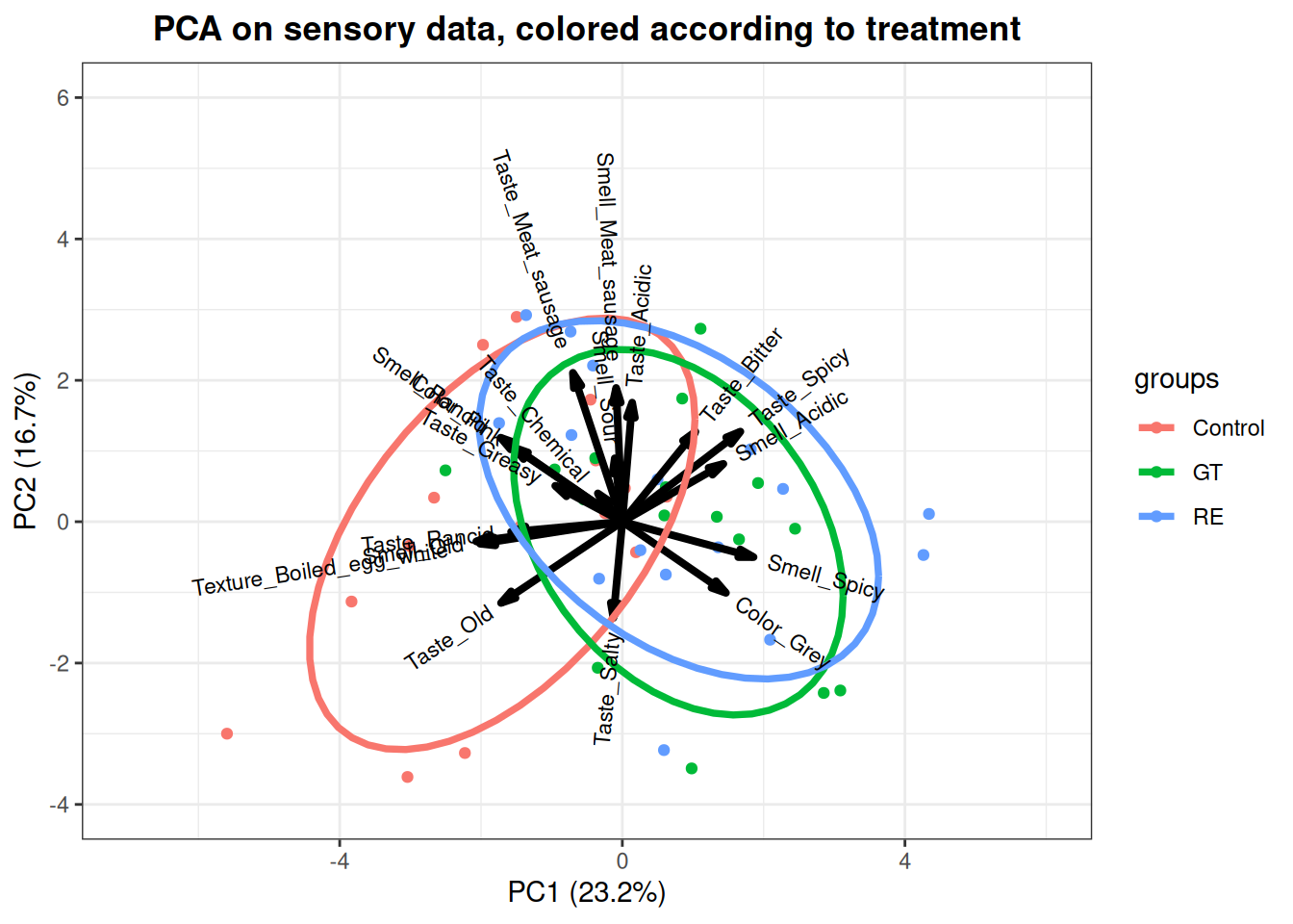
Figure 6.1: A biplot on PC1 and PC2 based on the meat preservation sensory data. Colored according to treatment. GT = Green tea; RE = rosemary extract.
In figure 6.1 above you see a biplot of the PCA model on the sensory data on the sausages from both weeks. The points represent the scores for all samples, colored according to antioxidant treatment.The ellipse = T in the R-code draws ellipses representing the distribution of each treatment. The arrows indicate the loadings of the sensory variables. The scores can be used to evaluate the differences between samples, and the underlying reason behind the differences is interpreted through the directionality and magnitude of the loadings. It is evident that there is a difference between the control and treated samples, since they are grouped differently, primarily in the PC1 direction. When compared to the loadings it seems that the control samples are characterised by more old, and rancid tastes and smells, which are sensorical attributes of lipid oxidation. Furhter the control samples have a boiled egg texture compared to the treated samples. On the other hand the treated samples are more spicy and bitter/acidic in taste and grey in color.
There are not registered any greater difference between the two green tea and rosemary extract samples.
Example 6.2
Example 6.2 - Near infrared spectroscopy of marzipan - PCA
The following example illustrates how principal component analysis (PCA) can be used to explore your data. The dataset in this example consists of 32 measurements on marzipan bread (marzipanbrød) made from 9 different recipes. The measurements have been acquired using near infrared spectroscopy (NIR) where light is passed through a sample and the transmitted light analysed. The output measurement is a spectrum showing how much light the sample has absorbed at each wavelenght.
Step 1 - Load packages and data
We start by loading the relevant libraries and importing the data.
library(ggplot2)load("Marzipan.RData")
Step 2 - Inspect raw spectra
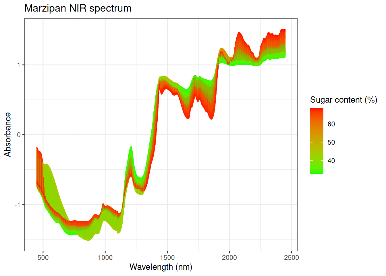
We can now plot the spectra colored according to sugar content (figure 6.2)
Figure 6.2: 32 NIR spectra measured on 9 different marcipan breads colored according to sugar content.
Looking at the raw spectral data we see that there is a concentration gradient in the spectra when we colour according to the sugar content. It seems that the main variation in the spectra has something to due with the sugar content.
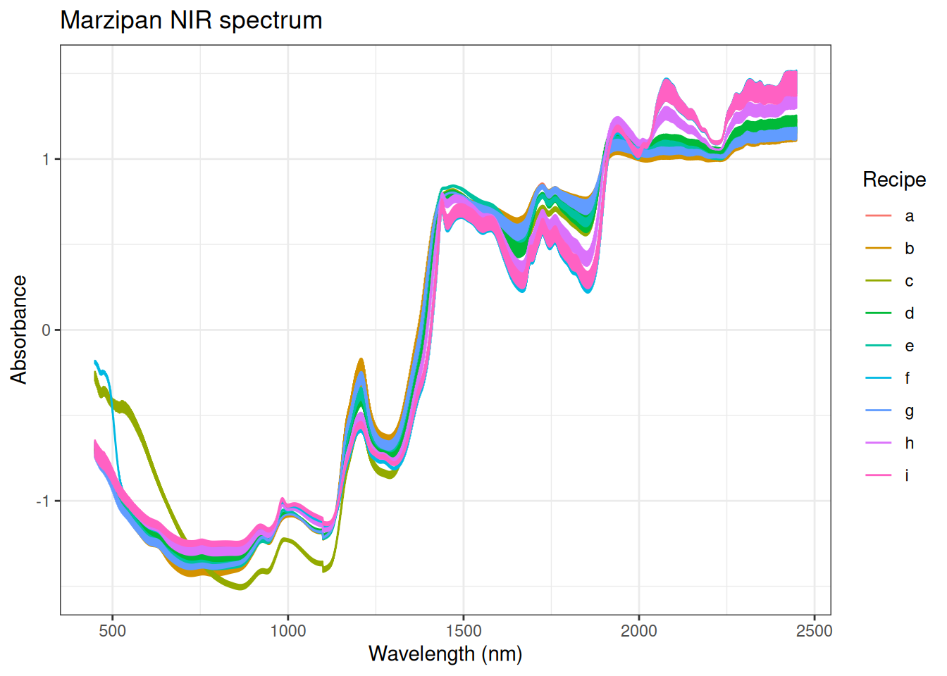
We can also plot the same spectra colored according to recipe (figure 6.3).
Figure 6.3: 32 NIR spectra measured on 9 different marcipan breads colored according to recipe.
Here we see that we can distinguish some of the recipes from each other. This can be explained by the varying sugar content in the recipes. Also, if we look in the region below 1100 nm and into the visible (≈ 370 − 750 nm) we note that samples made with recipe c is different compared to the other samples.
Step 3 - Calculate PCA model
We now make a PCA on the data and plot PC1 vs PC2 coloured according to sugar content.
# Transposing the data and removing the wavelength columnXt =t(X[,-1])# Making PCA on mean centered Xtmarzipan =prcomp(Xt, center =TRUE, scale =FALSE)# Extracting scores for plottingscores =data.frame(marzipan$x, sugar = Y$sugar)# Extracting % explained variance for plottingvarPC1 =round(summary(marzipan)$importance[2,1]*100)varPC2 =round(summary(marzipan)$importance[2,2]*100)
Step 4 - Plot the scores
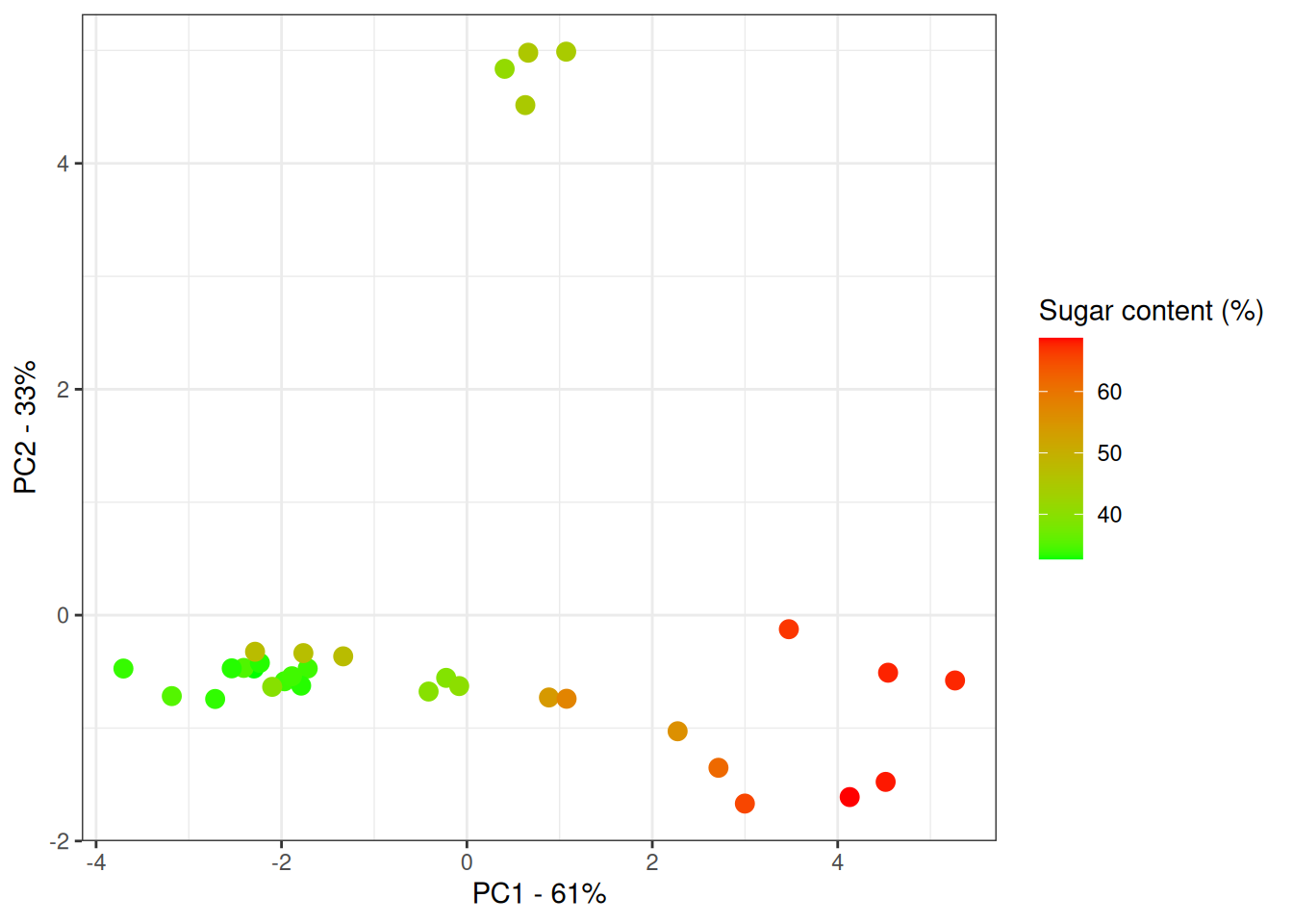
We can now plot the scores colored according to sugar content (figure 6.4).
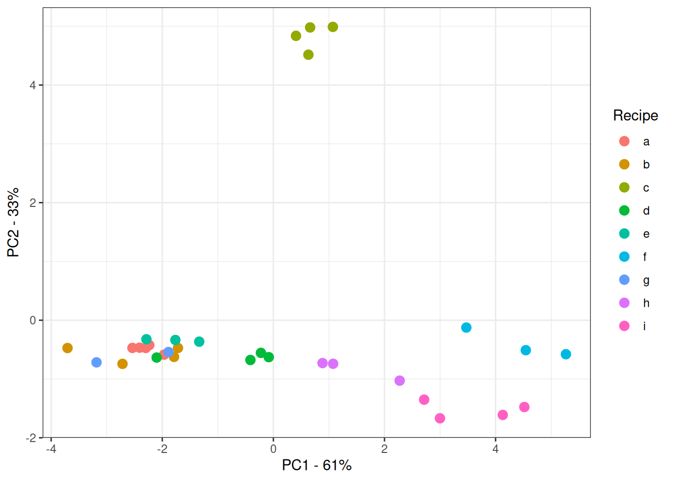
Figure 6.4: Score plot for NIR spectra of marzipan bread colored by sugar content.
We see that PC1 explains 61% of the variation in the data and that it seems to capture the variation in the sugar content. The samples are ordered from left to right in increasing concentration. Also, a group of samples are laying away from the rest when looking at PC2 which is explaining 33% of the variation in the data.
We can also color the scores according to recipe (figure 6.5).
Figure 6.5: Score plot for PCA based on the NIR spectra of marzipan bread colored by recipe.
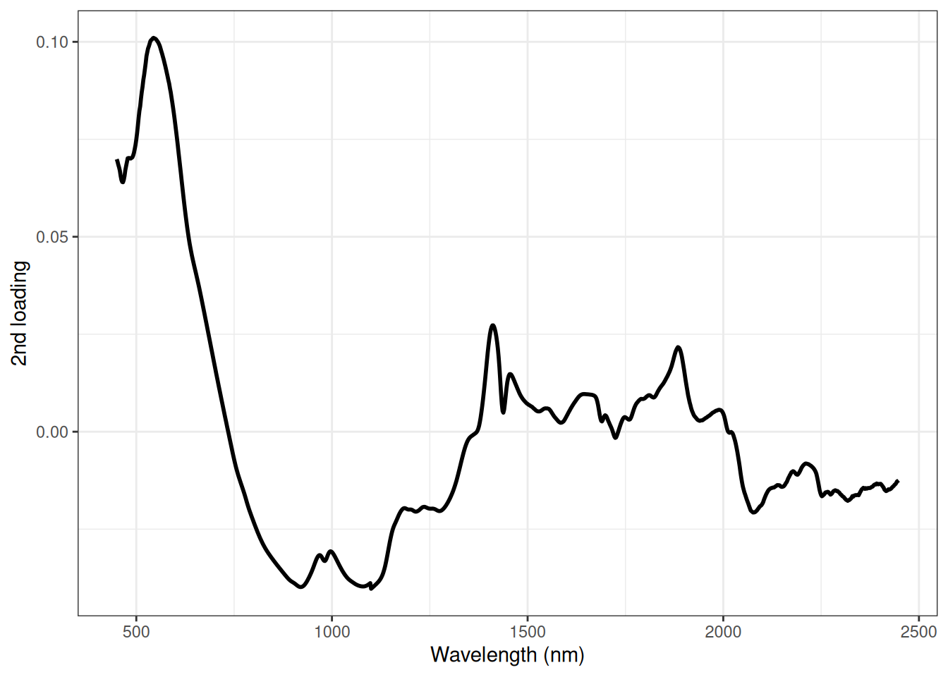
If we look at PC2 we see that it is the samples from recipe c that is laying away from the other samples. What is the reason for that? Let us look at the loadings. We start by looking at the second loading (figure 6.6) as it is dividing the samples from recipe c from the other samples.
Figure 6.6: Loading plot for PCA based on the NIR spectra of marzipan bread.
The main contribution to PC2 is the peak around 550 nm. So the reason why the samples from recipe c is different from the other is related to colour. This actually makes sense as this recipe has cocoa powder added to the recipe which will influence the colour of the marzipan bread.
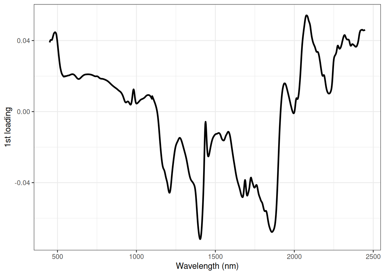
Lastly, we look at the first loading (figure 6.7).
Figure 6.7: Loading plot for PCA based on the NIR spectra of marzipan bread.
It is not straight forward to see which peaks are related to sugar. However, the peaks around 1200, 1400, 1875 and 2100 nm has the highest magnitude and therefore the main reason for the sugar content gradient we see in PC1. Actually all 4 peaks are related to either the C-H (Carbon - Hydrogen) or O-H groups in sugar or O-H in water. You will learn more about assigning peaks to chemical information in other courses later on.
6.3 Videos
6.3.1 PCA main ideas - StatQuest
6.3.2 PCA Introduction 1 - Rasmus Bro
6.3.3 PCA Introduction 2 - Rasmus Bro
6.4 Exercises
Exercise 6.1
Exercise 6.1 - McDonalds Data
The purpose of this exercise is to get familiar with PCA on a small intuitive dataset. The data - McDonaldsScaled.xlsx - constitutes of different fast food products and their nutritional content.
Tasks
Read in the data using an appropriate package / function (e.g. r read_excel() from the package readxl), and set up the data with row names etc.
McD <-read_xlsx("McDonaldsScaled.xlsx")# The first column has no name - change thatcolnames(McD)[1] <-"Item"head(McD)
Tasks
Make some initial descriptive plots for the five response variables, that indicate the distribution (center and spread).
Make some bi-variate scatter plots examining the relation between different variables, and comment on whether this relation is obvious and further, which types of samples are responsible for the relation. You can use the ggplot2 with stat_smooth() for this. Set method = "lm" to choose a linear model and se = F to disable the confidence intervals around the line.
ggplot(McD, aes(Energy, Protein)) +stat_smooth(method ="lm", se = F) +# Plot a linear modelgeom_point(size =3) +geom_text(aes(label = Item)) +theme_bw()
Tasks
Now, make a PCA on the data. What does the two options center = ... and scale. = ... refer to?
McD_pca <-prcomp(McD[2:6], center =TRUE, scale. =TRUE)
Tasks
If \(X_1, X_2, .., X_{19}\) is the protein variable in the dataset (i.e. \(X_1\) is the protein content of sample 1 and so forth), how do you calculate the centered and scaled representation of data, which could be called: \(X_1^{auto}, X_2^{auto}, .., X_{19}^{auto}\)?
Plot the PCA results and comment on them. There are several ways of doing this. The first described here, is to zack out the parameters (scores and loadings) and then use the ggplot2 functionality to plot those. Try to comprehend what is actually produced from the list of functions listed below.
# Zack out the individual parameters (scores and loadings and item names)scores <-data.frame(McD_pca$x)loadings <-data.frame(McD_pca$rotation)Items <- McD$Item# Score plotggplot(scores, aes(PC1, PC2, label = Items)) +geom_text()# Loading plotggplot(loadings, aes(PC1, PC2, label =row.names(loadings))) +geom_text()
Tasks
Alternatively you can utilize a package ggbiplot for making nice plots from PCA objects (see #exa-phenolic-antiox-pca) for more info on how to use this package).
Make a vector that indicates the different fast food types (Burger, Drinks, etc.). You can either do this by extending the excel file with a column, or do it in R (see this below). Infer this class information on the plot as color (or maker shape or size).
Try to modify the PCA by removing scaling and/or centering. What happens to the plots of the results? What do you think is going on?
Exercise 6.2
Exercise 6.2 - Analysis of coffee serving temperatura - PCA
In the dataset Results Panel.xlsx the sensorical results from a panel of eight judges, evaluating coffee served at six different temperatures each four times are listed. In this exercise, we are going to first average over judge and temperature followed by PCA to evaluate sensorical descriptor similarity as well as the effect of serving temperature on the perception of coffee.
Tasks
After import of data, and initial sanity check, calculate the average response across the four replicates. Use the summarise() or aggreggate() function with mean functions to make a dataset with the average response for the six different temperatures for each judge. For an example on how to do this see Section A.4.
Hint: The number of samples should be reduced by a factor of 4.
Use this data as input for construction of a PCA model. Which variables do you think should be included?
Make a biplot of this PCA model and interpret it.
Which descriptors go together and which are oppositely correlated?
Are there, from this analysis, a clear difference between the different serving temperatures?
What do you think blurs the picture?
The code below can be used for inspiration. Be aware, that we need to set a series of dependencies in order for this to work.
# Calculate mean per groupcoffee_ag <- coffee |>summarise(across(where(is.numeric), mean), # Compute mean over numeric variables .by =c(Assessor, Sample) # Group by judge and temp )# Compute PCA modelcoffee_pca <-prcomp(coffee_ag[your_variables_here])# Plot PCA modelggbiplot(coffee_pca, groups = coffee_ag$Temp,ellipse = T, circle = T, ellipse.fill = F) +scale_color_brewer(palette ="RdBu", direction =-1,name ="Temperature" ) +theme(legend.position ="bottom")
# Define variables to group bygroup_by <-list("Judge"= coffee$Assessor, "Temp"= coffee$Sample )# Calculate mean per groupcoffee_ag <-aggregate(coffee, group_by, mean)# Compute PCA modelcoffee_pca <-prcomp(coffee_ag[your_variables_here])# Plot PCA modelggbiplot(coffee_pca, groups = coffee_ag$Temp,ellipse = T, circle = T, ellipse.fill = F) +scale_color_brewer(palette ="RdBu", direction =-1,name ="Temperature" ) +theme(legend.position ="bottom")
Check out the ggbiplot() syntax (by ?ggbiplot). by adding stuff to the plot, it is modified to look exactly like you want it. Here we change legend appearance (for inferring temperature) and color scheme for the scores matching temperature. In order to also remove variation due to differences between judges, the dataset is compressed such that the rows reflect the average for each temperature (across judges and replicates). Then this dataset is used for constructing a PCA model and visualized.
Tasks
use the aggreggate() function to average across judges and replicates.
Hint: Modify the .by = argument in summarise() or the group_by-list in aggregate().
Make a PCA model on this dataset. Visualise and interpret it.
Use the code below to vizualize the model again - Can you figure out why this model on a data-matrix of 6 samples is different from the previous model (on a data-matrix of 48 samples)?
# Plot PCA modelggbiplot(coffee_pca, groups = coffee_ag$Temp,ellipse = T, circle = T, ellipse.fill = F) +scale_color_brewer(palette ="RdBu", direction =-1,name ="Temperature" ) +theme(legend.position ="bottom")
The plots are hard to interpret because
some of the labels are masked and
the points are way to small.
Tasks
Use the function xlim(c(low,high)) and geom_point(, aes(color = cofffee_ag$Temp) size = 5) and add them to the plot to fix these problems.
Exercise 6.3
Exercise 6.3 - Wine aromas
This exercise will take you through plotting, descriptive stats and PCA. Wine based on the same grape variety (Cabernet Sauvignon) from four different countries (Argentina, Australia, Chile and South Africa) were analyzed for aroma compound composition with GC-MS (gas chromatography coupled with mass spectrometry). The dataset can be found in the file “Wine.xlsx”, and it will form the basis for working with basic descriptive statistics, plots and PCA.
Descriptive statistics
Tasks
Start by importing the dataset “Wine.xlsx” to R and try to get an overview of it.
Hint: use the summary() function in R and/or have a look at the raw data in the Excel file.
How many wines were analyzed from each country?
How many variables are there in the dataset, and how many constitutes the aroma profile?
For the descriptive statistics, only two of the aroma compounds are selected. Choose two on your own or make the calculations for the aroma compounds benzaldehyde (almond like aroma) and 3-Methylbutyl acetate (sweet fruit/banana like aroma).
Tasks
Calculate mean, variance, standard deviation, median and inner quartile range for the selected aroma compounds from each of the four different countries.
Hint: it can be helpful to create a separate dataset for each country, which can be done with the function subset().
Plots
Tasks
Make a boxplot, a jitterplot and a combination of the two with all 4 countries in one plot. Use the R-commands from the notes as inspiration.
What do you see? Discuss pros and cons of the different plots.
Adjust the layout of your favorite plots (e.g. color, background, title etc.). Think about how the data is presented in the best way. Actually, it can be rather beneficial to specify a generic theme including title and label font size, background color of the plot etc, which then can be added to each plot produced.
PCA
Working with a dataset with many variables, PCA provides a very nice tool to give an overview of the dataset. First we define the data we want to include in the analysis. With logical indexing wine[4:20] we choose the variables to include (i.e. we are only interested in analyzing the aroma compounds).
Tasks
Use the `prcomp function to calculate a PCA model on scaled aroma data. What does the arguments scale. = T and center = T do the to the data?
What do you see in the score and the loadings plot?
Can you see a grouping of the data? If so, how are the groups different?
Source Code
# Principal Component Analysis (PCA)```{r}#| label: pca setup#| echo: false#| message: false#| warning: falselibrary(dplyr)library(ggbiplot)library(here)```::: {.callout-tip}## Learning objectives* Be able to compute a Principal Component Analysis (PCA) model.* Know that PCA can be utilized for getting information on the multivariate sample distribution and variable correlation structure. * Comprehend how this is a generalization of the tools used for uni- and bivariate data such as; histograms/jitterplot/boxplot, scatterplots and correlation coefficient. *The mathematical formulation of the PCA is not a theme for this weeks learning.*:::## Reading material* [Principle Component Analysis (PCA) - in short](#sec-pca-intro)* Videos on PCA * [PCA main ideas by StatQuest](#sec-pca-main-ideas) * [PCA Introduction 1 by Rasmus Bro](#sec-pca-intro-1) * [PCA Introduction 2 by Rasmus Bro](#sec-pca-intro-2)* Chapter 2 in [Biological Data analysis and Chemometrics](http://www2.imm.dtu.dk/courses/27411/Rin27411.pdf) by Brockhoff* Chapter 4 (4.1 to 4.5) in *Chemometrics With R: Multivariate Data Analysis in the Natural Sciences and Life Sciences by Ron Wehrens (2012)*. Springer, Heidelberg. Available in Absalon.## Principle Component Analysis (PCA) - in short {#sec-pca-intro}Principal Component Analysis (PCA) is a method for understanding multivariate data. By multivariate data we mean a set of samples/observations ($n$) which are characterized on a number of different features ($p$). For example:* Different beers ($n = 20$) analyzed for $p = 60$ chemical variables reflecting the aroma composition.* Six coffee samples ($n = 6$) assessed on a set of sensorical descriptors ($p = 12$) by sensorical panel of eight judges ($n = 48$).* A range of oil samples ($n = 40$) analyzed by near infrared spectroscopy ($p = 400$).The data is often arranged in a data table (referred to as $\mathbf{X}$) with $n$ rows (samples) and $p$ columns (variables). For almost all real life applications such multivariate data are correlated. That is; some of the variables carry the same type of information, and the interesting information in these data is captured by this so-called correlation structure. A nice visualization of the correlation is done via a scatter plot of two variables. For a few variables (say $p = 5$) it is possible to interpret all combinations of two variables. If $p = 5$ that amounts to $\frac{p(p-1)}{2} = 10$ plots. However, when $p$ is high this becomes in-practical. PCA deals with this issue by compressing the data into a set of components:$$\mathbf{X} = \mathbf{t}_1 \mathbf{p}_1^T + \mathbf{t}_2 \mathbf{p}_2^T + \cdots + \mathbf{t}_k \mathbf{p}_k^T + \mathbf{E}$$Notation wise, $\mathbf{X} \sim (n, p)$ is a matrix, $\mathbf{t_i} \sim (n,1)$ and $\mathbf{p_i} \sim (p,1)$ are vectors.* $\mathbf{t}_1$ are scores for component 1 ($\mathbf{t}_2$ are scores for component 2 and so forth) and tells something about the multivariate sample distribution.* $\mathbf{p}_1$ are loadings for component 1 ($\mathbf{p}_2$ are loadings for component 2 and so forth) and tells something about the multivariate correlation structure between the variables.* A set of $\mathbf{t}_1$ and $\mathbf{p}_1$ is referred to as a component.The power of PCA is when the mathematical decomposition into scores and loadings is combined with visualization of these. That is:* **Score plot** - scatter plots of combination of scores (often $\mathbf{t}_1$ vs. $\mathbf{t}_2$).* **Loading plot** - scatter plots of combination of loadings (often $\mathbf{p}_1$ vs. $\mathbf{p}_2$).* **Bi plot** - overlayed score- and loading plot.::: {#exa-phenolic-antiox-pca}<!-- Cross-ref anchor -->:::::: {.callout-example}### Natural phenolic antioxidants for meat preservation - PCA```{r}#| label: pca example 1 setup#| echo: false#| message: false#| warning: falseload(here("data", "meat_data.RData"))```This data originates from a study investigating the effect of natural phenolic antioxidants against lipid and protein oxidation during sausage production and storage. Bologna-type sausages wereprepared and treated with either green tea (GT) or rosemary extract (RE) as antioxidants, and a control batch was also included. The three types of sausages were evaluated by a sensory panel including 8 assessors, on 18 different descriptors within the categories *smell*, *color*, *taste* and *texture*. The sausages were evaluated immediately after production (*week0*) and after four weeks of storage(*week4*). Data is from: Jongberg, Sisse, et al. ”Effect of green tea or rosemary extract on protein oxidation in Bologna type sausages prepared from oxidatively stressed pork.” *Meat Science* 93.3 (2013): 538-546.**Step 1 - Load libraries** Note that these need to be installed beforehand.```{r}#| eval: false#| code-line-numbers: falselibrary(ggplot2)library(ggbiplot)```**Step 2 - Load the data**Remember to set your [working directory](#sec-r-basics-working-directory).```{r}#| eval: false#| code-line-numbers: falseload("meat_data.RData")```**Step 3 - Calculate the PCA model** The data frame `X` consists of $p = 20$ columns, however only the last 18 are response variables, whereas the first two refers to the study design. In PCA only the response variables are used to calculate the model, whereas the design is used for e.g. coloring of the score plot.```{r}#| code-line-numbers: falsePCA <-prcomp(X[,3:20], center =TRUE, scale. =TRUE)```**Step 4 - Plot the model** The `ggbiplot()` function nicely plots a so-called biplot. Below a lot of features are added to the plot, but `ggbiplot(PCA)` will produce something which is similar.```{r}#| code-line-numbers: false#| label: fig-meat-biplot#| fig-cap: A biplot on PC1 and PC2 based on the meat preservation sensory data. Colored according to treatment. GT = Green tea; RE = rosemary extract.ggbiplot(PCA, groups = X$Treatment, obs.scale =1, var.scale =1, ellipse = T, ellipse.fill = F) +# Create the biplotggtitle("PCA on sensory data, colored according to treatment") +# Add titleylim(-4, 6) +# Set y-axis limitsxlim(-7, 6) +# Set x-axis limtstheme_bw() +# Set theme as "black and white"theme(plot.title =element_text(hjust =0.5, face ="bold")) # Adjust title ```In @fig-meat-biplot above you see a biplot of the PCA model on the sensory data on the sausages from both weeks. The points represent the scores for all samples, colored according to antioxidant treatment.The `ellipse = T` in the R-code draws ellipses representing the distribution of each treatment. The arrows indicate the loadings of the sensory variables. The scores can be used to evaluate the differencesbetween samples, and the underlying reason behind the differences is interpreted through the directionality and magnitude of the loadings. It is evident that there is a difference between the control and treated samples, since they are grouped differently, primarily in the PC1 direction. When compared to the loadings it seems that the control samples are characterised by more old, and rancid tastes and smells, which are sensorical attributes of lipid oxidation. Furhter the control samples have a boiled egg texture compared to the treated samples. On the other hand the treated samples are more spicy and bitter/acidic in taste and grey in color. There are not registered any greater difference between the two green tea and rosemary extract samples.:::<!-- End example callout -->::: {#exa-nirs-marzipan-pca}<!-- Cross-ref anchor -->:::::: {.callout-example}### Near infrared spectroscopy of marzipan - PCA```{r}#| label: pca example 2 setup#| echo: false#| message: false#| warning: falseload(here("data", "Marzipan.RData"))```The following example illustrates how principal component analysis (PCA) can be used to explore your data. The dataset in this example consists of 32 measurements on marzipan bread (marzipanbrød) made from 9 different recipes. The measurements have been acquired using near infrared spectroscopy (NIR) where light is passed through a sample and the transmitted light analysed. The output measurement is a spectrum showing how much light the sample has absorbed at each wavelenght. **Step 1 - Load packages and data** We start by loading the relevant libraries and importing the data.```{r}#| eval: falselibrary(ggplot2)load("Marzipan.RData")```**Step 2 - Inspect raw spectra** We can now plot the spectra colored according to sugar content (@fig-marzipan-spectra-sugar)```{r}#| label: fig-marzipan-spectra-sugar#| fig-cap: 32 NIR spectra measured on 9 different marcipan breads colored according to sugar content.ggplot(Xm, aes(wavelength, value, color = sugar)) +geom_line() +scale_colour_gradient(low ="green", high ="red") +labs(title ="Marzipan NIR spectrum",y ="Absorbance",x ="Wavelength (nm)",color ="Sugar content (%)") +theme_bw()```Looking at the raw spectral data we see that there is a concentration gradient in the spectra when we colour according to the sugar content. It seems that the main variation in the spectra has something to due with the sugar content. We can also plot the same spectra colored according to recipe (@fig-marzipan-spectra-recipe).```{r}#| code-fold: true#| label: fig-marzipan-spectra-recipe#| fig-cap: 32 NIR spectra measured on 9 different marcipan breads colored according to recipe.# Extract recipe from variable nameXm$recipe <-substr(Xm$variable, 1, 1)ggplot(Xm, aes(wavelength, value, color = recipe)) +geom_line() +labs(title ="Marzipan NIR spectrum",y ="Absorbance",x ="Wavelength (nm)",color ="Recipe") +theme_bw()```Here we see that we can distinguish some of the recipes from each other. This can be explained by the varying sugar content in the recipes. Also, if we look in the region below 1100 nm and into the visible (≈ 370 − 750 nm) we note that samples made with recipe c is different compared to the other samples.**Step 3 - Calculate PCA model** We now make a PCA on the data and plot PC1 vs PC2 coloured according to sugar content.```{r}# Transposing the data and removing the wavelength columnXt =t(X[,-1])# Making PCA on mean centered Xtmarzipan =prcomp(Xt, center =TRUE, scale =FALSE)# Extracting scores for plottingscores =data.frame(marzipan$x, sugar = Y$sugar)# Extracting % explained variance for plottingvarPC1 =round(summary(marzipan)$importance[2,1]*100)varPC2 =round(summary(marzipan)$importance[2,2]*100)```**Step 4 - Plot the scores** We can now plot the scores colored according to sugar content (@fig-marzipan-score-plot-sugar).```{r}#| label: fig-marzipan-score-plot-sugar#| fig-cap: Score plot for NIR spectra of marzipan bread colored by sugar content.ggplot(scores, aes(PC1, PC2, color = sugar)) +geom_point(size =3) +scale_color_gradient(low ="green", high ="red") +labs(x =paste("PC1 - ",varPC1, "%", sep =""), # Insert exp.var. as labely =paste("PC2 - ",varPC2, "%", sep =""),color ="Sugar content (%)") +theme_bw()```We see that PC1 explains 61% of the variation in the data and that it seems to capture the variation in the sugar content. The samples are ordered from left to right in increasing concentration. Also, a group of samples are laying away from the rest when looking at PC2 which is explaining 33% of the variation in the data. We can also color the scores according to recipe (@fig-marzipan-score-plot-recipe).```{r}#| label: fig-marzipan-score-plot-recipe#| fig-cap: Score plot for PCA based on the NIR spectra of marzipan bread colored by recipe.# Extract recipe from sample namescores$recipe <-substr(Y$sample, 1, 1)ggplot(scores, aes(PC1, PC2, color = recipe)) +geom_point(size =3) +labs(x =paste("PC1 - ",varPC1, "%", sep =""), # Insert exp.var. as labely =paste("PC2 - ",varPC2, "%", sep =""),color ="Recipe") +theme_bw()```If we look at PC2 we see that it is the samples from recipe c that is laying away from the other samples. What is the reason for that? Let us look at the loadings. We start by looking at the second loading (@fig-marzipan-loading-plot-pc2) as it is dividing the samples from recipe c from the other samples.```{r}#| label: fig-marzipan-loading-plot-pc2#| fig-cap: Loading plot for PCA based on the NIR spectra of marzipan bread. # Extract loadings from PCA modelloadings =as.data.frame(marzipan$rotation)ggplot(loadings, aes(wl, PC2)) +geom_line(linewidth =1) +labs(x ="Wavelength (nm)",y ="2nd loading" ) +theme_bw()```The main contribution to PC2 is the peak around 550 nm. So the reason why the samples from recipe c is different from the other is related to colour. This actually makes sense as this recipe has cocoa powder added to the recipe which will influence the colour of the marzipan bread.Lastly, we look at the first loading (@fig-marzipan-loading-plot-pc1).```{r}#| label: fig-marzipan-loading-plot-pc1#| fig-cap: Loading plot for PCA based on the NIR spectra of marzipan bread. ggplot(loadings, aes(wl, PC1)) +geom_line(linewidth =1) +labs(x ="Wavelength (nm)",y ="1st loading" ) +theme_bw()```It is not straight forward to see which peaks are related to sugar. However, the peaks around 1200, 1400, 1875 and 2100 nm has the highest magnitude and therefore the main reason for the sugar content gradient we see in PC1. Actually all 4 peaks are related to either the C-H (Carbon - Hydrogen) or O-H groups in sugar or O-H in water. You will learn more about assigning peaks to chemical information in other courses later on.:::<!-- End example callout -->## Videos### PCA main ideas - *StatQuest* {#sec-pca-main-ideas}{{< video https://www.youtube.com/watch?v=HMOI_lkzW08 >}}### PCA Introduction 1 - *Rasmus Bro* {#sec-pca-intro-1}{{< video https://www.youtube.com/watch?v=K-F19DORO1w&list=PLBC24FD8C389FE9E4&index=1 >}}### PCA Introduction 2 - *Rasmus Bro* {#sec-pca-intro-2}{{< video https://www.youtube.com/watch?v=26YhtSJi1qc&list=PLBC24FD8C389FE9E4&index=2 >}}## Exercises::: {#ex-mcdonalds-data}<!-- Cross-ref anchor -->:::::: {.callout-exercise}### McDonalds DataThe purpose of this exercise is to get familiar with PCA on a small intuitive dataset. The data - `McDonaldsScaled.xlsx` - constitutes of different fast food products and their nutritional content. ::: {.callout-task}1. Read in the data using an appropriate package / function (e.g. r `read_excel()` from the package readxl), and set up the data with row names etc.:::```{r}#| eval: falseMcD <-read_xlsx("McDonaldsScaled.xlsx")# The first column has no name - change thatcolnames(McD)[1] <-"Item"head(McD)```::: {.callout-task}2. Make some initial descriptive plots for the five response variables, that indicate the distribution (center and spread).3. Make some bi-variate scatter plots examining the relation between different variables, and comment on whether this relation is obvious and further, which types of samples are responsible for the relation. You can use the ggplot2 with `stat_smooth()` for this. Set `method = "lm"` to choose a linear model and `se = F` to disable the confidence intervals around the line. :::```{r}#| eval: falseggplot(McD, aes(Energy, Protein)) +stat_smooth(method ="lm", se = F) +# Plot a linear modelgeom_point(size =3) +geom_text(aes(label = Item)) +theme_bw()```::: {.callout-task}4. Now, make a PCA on the data. What does the two options `center = ...` and `scale. = ...` refer to?:::```{r}#| eval: falseMcD_pca <-prcomp(McD[2:6], center =TRUE, scale. =TRUE)```::: {.callout-task}5. If $X_1, X_2, .., X_{19}$ is the protein variable in the dataset (i.e. $X_1$ is the protein content of sample 1 and so forth), how do you calculate the centered and scaled representation of data, which could be called: $X_1^{auto}, X_2^{auto}, .., X_{19}^{auto}$?6. Plot the PCA results and comment on them. There are several ways of doing this. The first described here, is to zack out the parameters (scores and loadings) and then use the ggplot2 functionality to plot those. Try to comprehend what is actually produced from the list of functions listed below.:::```{r}#| eval: false# Zack out the individual parameters (scores and loadings and item names)scores <-data.frame(McD_pca$x)loadings <-data.frame(McD_pca$rotation)Items <- McD$Item# Score plotggplot(scores, aes(PC1, PC2, label = Items)) +geom_text()# Loading plotggplot(loadings, aes(PC1, PC2, label =row.names(loadings))) +geom_text()```::: {.callout-task}7. Alternatively you can utilize a package ggbiplot for making nice plots from PCA objects (see #exa-phenolic-antiox-pca) for more info on how to use this package).:::```{r}#| eval: falseggbiplot(McD_pca, obs.scale =1, var.scale =1) +geom_text(label = Items) +theme_bw()```::: {.callout-task}8. Make a vector that indicates the different fast food types (Burger, Drinks, etc.). You can either do this by extending the excel file with a column, or do it in R (see this below). Infer this class information on the plot as color (or maker shape or size).:::```{r}#| eval: falseCategories <-c(rep("Burger", 9),rep("Drink", 3),rep("Icecream", 3),rep("Other", 2),rep("Salad", 2))ggbiplot(McD_pca, obs.scale =1, var.scale =1) +geom_text(aes(label = Items, color = Categories)) +theme_bw()```::: {.callout-task}9. Try to modify the PCA by removing scaling and/or centering. What happens to the plots of the results? What do you think is going on?::::::::: {#ex-coffee-serving-temp}<!-- Cross-ref anchor -->:::::: {.callout-exercise}### Analysis of coffee serving temperatura - PCAIn the dataset *Results Panel.xlsx* the sensorical results from a panel of eight judges, evaluating coffee served at six different temperatures each four times are listed. In this exercise, we are going to first average over judge and temperature followed by PCA to evaluate sensorical descriptor similarity as well as the effect of serving temperature on the perception of coffee.::: {.callout-task}1. After import of data, and initial sanity check, calculate the average response across the four replicates. Use the `summarise()` or `aggreggate()` function with `mean` functions to make a dataset with the average response for the six different temperatures for each judge. For an example on how to do this see @sec-summarise-by-group. * Hint: The number of samples should be reduced by a factor of 4.2. Use this data as input for construction of a PCA model. Which variables do you think should be included?3. Make a biplot of this PCA model and interpret it. a. Which descriptors go together and which are oppositely correlated? a. Are there, from this analysis, a clear difference between the different serving temperatures? a. What do you think blurs the picture?:::The code below can be used for inspiration. Be aware, that we need to set a series of dependencies in order for this to work.::: {.panel-tabset}### Using `summarise()````{r}#| eval: false# Calculate mean per groupcoffee_ag <- coffee |>summarise(across(where(is.numeric), mean), # Compute mean over numeric variables .by =c(Assessor, Sample) # Group by judge and temp )# Compute PCA modelcoffee_pca <-prcomp(coffee_ag[your_variables_here])# Plot PCA modelggbiplot(coffee_pca, groups = coffee_ag$Temp,ellipse = T, circle = T, ellipse.fill = F) +scale_color_brewer(palette ="RdBu", direction =-1,name ="Temperature" ) +theme(legend.position ="bottom")```### Using `aggregate()````{r}#| eval: false# Define variables to group bygroup_by <-list("Judge"= coffee$Assessor, "Temp"= coffee$Sample )# Calculate mean per groupcoffee_ag <-aggregate(coffee, group_by, mean)# Compute PCA modelcoffee_pca <-prcomp(coffee_ag[your_variables_here])# Plot PCA modelggbiplot(coffee_pca, groups = coffee_ag$Temp,ellipse = T, circle = T, ellipse.fill = F) +scale_color_brewer(palette ="RdBu", direction =-1,name ="Temperature" ) +theme(legend.position ="bottom")```:::Check out the `ggbiplot()` syntax (by `?ggbiplot`). by adding stuff to the plot, it is modified to look exactly like you want it. Here we change legend appearance (for inferring temperature) and color scheme for the scores matching temperature. In order to also remove variation due to differences between judges, the dataset is compressed such that the rows reflect the average for each temperature (across judges and replicates). Then this dataset is used for constructing a PCA model and visualized.::: {.callout-task}4. use the aggreggate() function to average across judges and replicates. * Hint: Modify the `.by =` argument in `summarise()` or the `group_by`-list in `aggregate()`. 5. Make a PCA model on this dataset. Visualise and interpret it.6. Use the code below to vizualize the model again - Can you figure out why this model on a data-matrix of 6 samples is different from the previous model (on a data-matrix of 48 samples)?:::```{r}#| eval: false#| # Plot PCA modelggbiplot(coffee_pca, groups = coffee_ag$Temp,ellipse = T, circle = T, ellipse.fill = F) +scale_color_brewer(palette ="RdBu", direction =-1,name ="Temperature" ) +theme(legend.position ="bottom")```The plots are hard to interpret because * some of the labels are masked and * the points are way to small. ::: {.callout-task}7. Use the function `xlim(c(low,high))` and `geom_point(, aes(color = cofffee_ag$Temp) size = 5)` and add them to the plot to fix these problems.::::::::: {#ex-wine-aromas-pca}<!-- Cross-ref anchor -->:::::: {.callout-exercise}### Wine aromasThis exercise will take you through plotting, descriptive stats and PCA. Wine based on the same grape variety (Cabernet Sauvignon) from four different countries (Argentina, Australia, Chile and South Africa) were analyzed for aroma compound composition with GC-MS (gas chromatography coupled with mass spectrometry). The dataset can be found in the file “Wine.xlsx”, and it will form the basis for working with basic descriptive statistics, plots and PCA.#### Descriptive statistics::: {.callout-task}1. Start by importing the dataset “Wine.xlsx” to R and try to get an overview of it. * Hint: use the `summary()` function in R and/or have a look at the raw data in the Excel file. a. How many wines were analyzed from each country? a. How many variables are there in the dataset, and how many constitutes the aroma profile?:::For the descriptive statistics, only two of the aroma compounds are selected. Choose two on your own or make the calculations for the aroma compounds benzaldehyde (almond like aroma) and 3-Methylbutyl acetate (sweet fruit/banana like aroma). ::: {.callout-task}2. Calculate mean, variance, standard deviation, median and inner quartile range for the selected aroma compounds from each of the four different countries. * Hint: it can be helpful to create a separate dataset for each country, which can be done with the function `subset()`.:::#### Plots::: {.callout-task}3. Make a boxplot, a jitterplot and a combination of the two with all 4 countries in one plot. Use the R-commands from the notes as inspiration.4. What do you see? Discuss pros and cons of the different plots.5. Adjust the layout of your favorite plots (e.g. color, background, title etc.). Think about how the data is presented in the best way. Actually, it can be rather beneficial to specify a generic theme including title and label font size, background color of the plot etc, which then can be added to each plot produced.:::#### PCAWorking with a dataset with many variables, PCA provides a very nice tool to give an overview of the dataset. First we define the data we want to include in the analysis. With logical indexing `wine[4:20]` we choose the variables to include (i.e. we are only interested in analyzing the aroma compounds).::: {.callout-task}6. Use the ``prcomp` function to calculate a PCA model on scaled aroma data. What does the arguments `scale. = T` and `center = T` do the to the data? * Try changing them to `= F` (false).7. Make a score plot and a loading plot. :::```{r}#| eval: false# Compute PCA modelwine_pca <-prcomp(wine[4:58], scale. = T, center = T)# Create score plot (biplot without arrows)ggbiplot(wine_pca, groups = wine$Country, point.size =3,var.axes = F)# Extract loadings and loading nameswine_loadings <-data.frame(wine_pca$rotation)loading_names <-rownames(wine_loadings)# Create "manual" loading plotggplot(wine_loadings, aes(PC1, PC2)) +geom_text(aes(label = loading_names,color = loading_names),show.legend = F) +theme_bw()# Create biplotggbiplot(wine_pca, groups =factor(wine$class), point.size =3)```::: {.callout-task}8. What do you see in the score and the loadings plot?9. Can you see a grouping of the data? If so, how are the groups different?::::::