The package ggplot2 for R is a versatile tool for producing various plots with the option of modifying them in great detail. It is based on layers, which mean the you build your plots layer by layer.
To create visualizations with ggplot2, you first need to load your data into R. For this example, the built-in iris data set is used.
library(ggplot2) # Load ggplot2my_data <- iris # Loads the built-in example data set called "iris"head(my_data) # Print the first 6 rows of the data
levels(my_data$Species) # Get the levels of species
[1] "setosa" "versicolor" "virginica"
It is clear that the data consists of measurements of sepals and petals of three different species of flowers. If we want to plot the Sepal.Length variable against the Sepal.Width variable it can be done by using ggplot2 as shown below.
ggplot(data = my_data, aes(x = Sepal.Length, y = Sepal.Width))
In the code above we tell ggplot that we want to plot data using the dataframe my_data. Furthermore, we tell it that we want Sepal.Length on the x-axis and Sepal.Width on the y-axis. There is, however, one problem: The plot above does not contain any data points. This is due to the fact that we have not added any geometric objects or geoms as they are called. The geom for points is added to the code below.
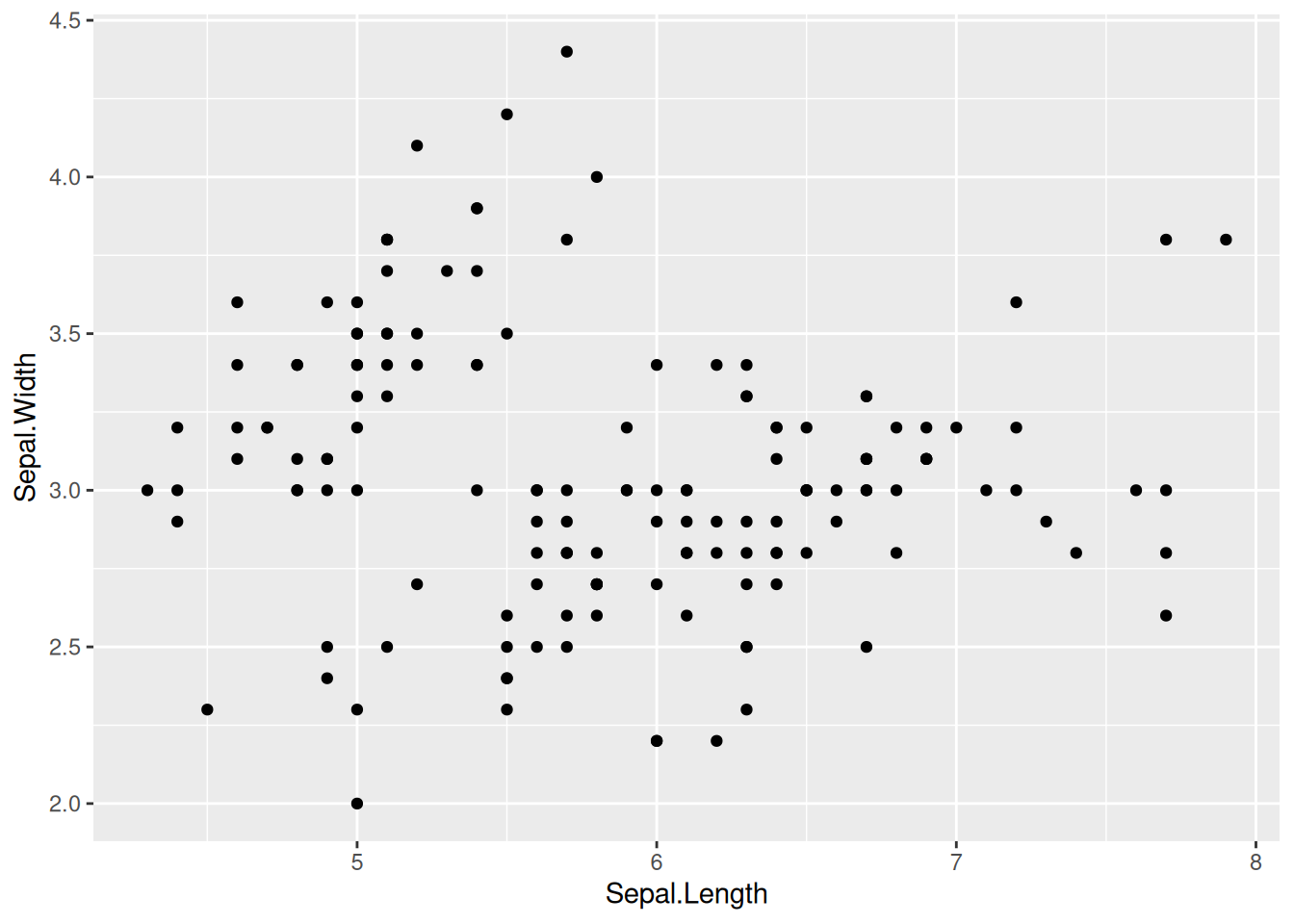
ggplot(data = my_data, aes(x = Sepal.Length, y = Sepal.Width)) +# Notice the "+" signgeom_point()
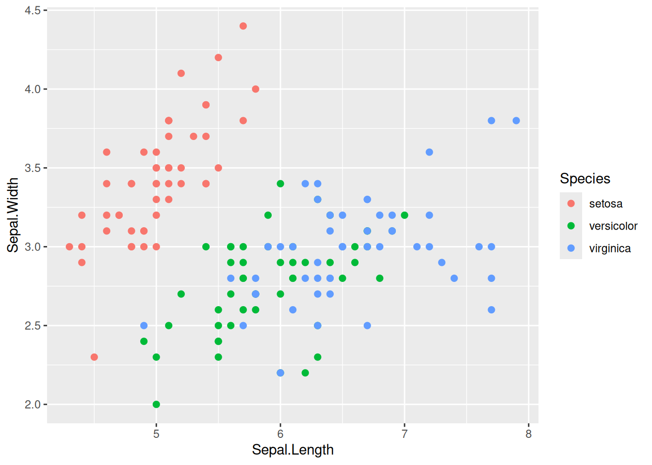
Notice how the data has been “given” to the geom_point() call and we now see data points. If we want to add some color, we can tell ggplot2 to assign a color to each species in the data set.
ggplot(data = my_data, aes(x = Sepal.Length, y = Sepal.Width, color = Species)) +geom_point(size =2)
When using ggplot2 the data given in a so called aesthetic which is denoted by the aes() inside the ggplot() call. An aesthetic mapping describes how to visual elements are mapped to the variables. The aes(x = Sepal.Length, y = Sepal.Width, color = Species) within the ggplot() call is passed down to all geoms below such that multiple layers can use the same data without having the specify it each time.
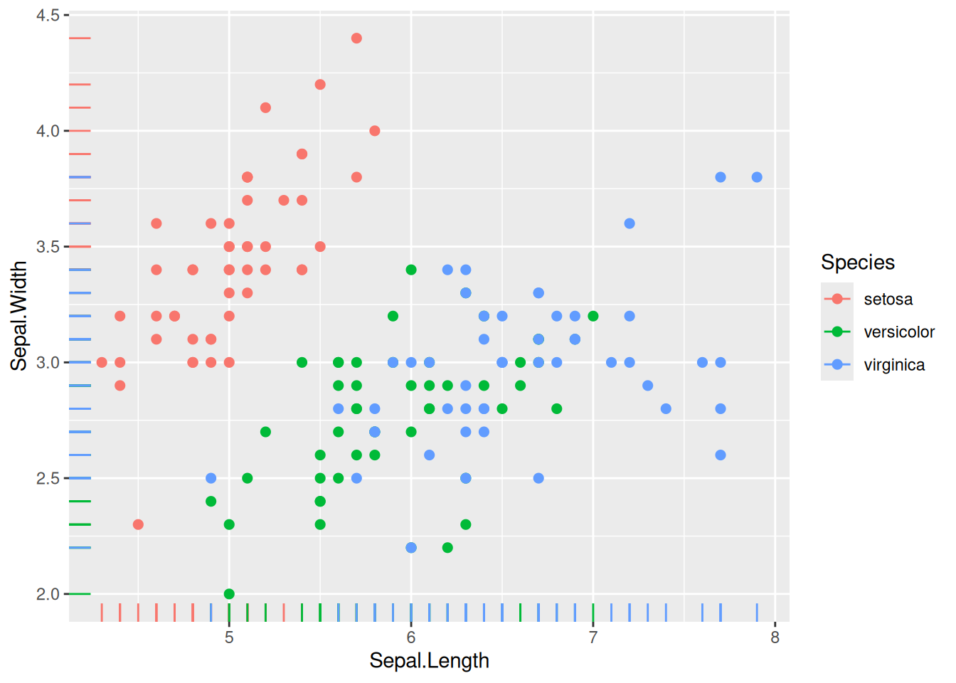
ggplot(data = my_data, aes(x = Sepal.Length, y = Sepal.Width, color = Species)) +geom_point(size =2) +geom_rug() # This geom also uses the specified data
The possible settings for each geom can be found using ?geom_point() or by letting the cursor hover in the geom name and pressing F1.
5.2.1 Saving plots as variables
Plots can also be saved as variables. This is often useful for more advanced plots and when you want to create different plots using loops etc.
For example, the plot directly above can also be created as
plt <-ggplot(data = my_data, aes(x = Sepal.Length, y = Sepal.Width, color = Species))plt <- plt +geom_point(size =2)plt <- plt +geom_rug()
And then shown using
plt # Show plot
5.2.2 Saving plots from ggplot
Saving plots as image or vector type formats can be done using ggsave().
# Save as png with standard settings using current aspect ratioggsave("my_plot.png")# Save the "plt" plot using standard settingsggsave("my_plot.png", plot = plt)# Save the custom width and height oc 10 x 20 cmggsave("my_plot.png", width =10, height =20, units ="cm") # Save as svg (a vector format) with standard settings using current aspect ratioggsave("my_plot.svg")
Sometimes it takes some playing around to get settings that scale nice, but it is by far the best way to export ggplot figures out of R.
Important
The figures will be saved to your current working directory. You can see the current working directory using getwd().
5.3 Exercises
The package ggplot2 for R is a versatile tool for producing various plots with the option of modifying them in great detail. The following exercises should guide you through the basic functionality of the ggplot function and show you how you can layer different geoms to produce the plots you want.
Before you start
Start by importing a dataset and specify some necessary packages (If you have not installed them on your local drive, you might need to do so). The following lines of code will do the job, if you specify the correct working directory.
# Load package for importing Excel-fileslibrary(readxl) # Import coffee data setcoffee <-read_excel("Results Consumer Test.xlsx")
There are several ways of importing data into R, depending on which format you have them in. From excel, the read.xls() (from the gdata library) or read_excel() (from the readxl library) are two ways of doing it. In either case, make sure that the data is correctly imported, by comparing the imported data with the original - sometimes there are problems with decimals.
Assume that you have a single response variable, for instance alcohol content of a series of various types of drinks, measurements of body weight from an nutritional experiment or content of antioxidants for a given product produced under different conditions. For all of these, the variable is continuous in form. As a starting point of every analysis an overview of the distribution of the variable of interest is crucial, and plotting the distribution facilitate insight into character of distribution (bell shaped, skewness, bi modal, zero inflated etc.) and single point information for outlier identification.
Exercise 5.1
Exercise 5.1 - Before you start
Start by loading the ggplot2 and the readxl package. Use the readxl package to import a data that can be used for plotting. The code below will help you on your way.
# If you have not installed the packaged below remember to do so.# install.packages("readxl")# install.packages("ggplot2")library(readxl) # Load package for importing Excel-fileslibrary(ggplot2) # Load package for plotting data# Import coffee data setcoffee <-read_excel("Results Consumer Test.xlsx")
Important
If you get the following error
Error: “Results Consumer Test” does not exist in current working directory”
or something similar, it might be due to the following things:
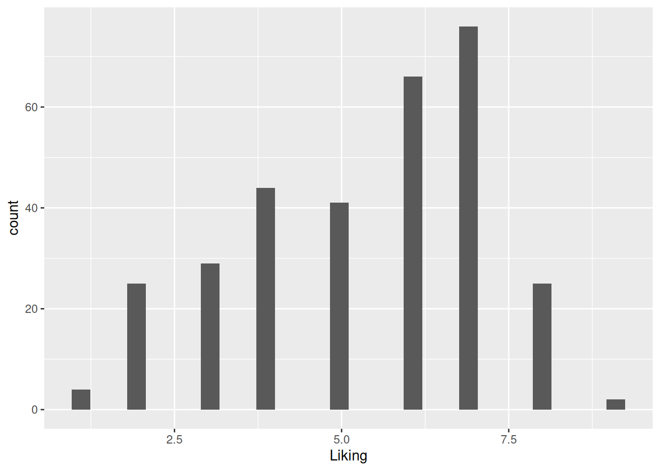
Figure 5.1: A simple histogram of the “Liking” variable in the coffee consumer dataset.
There are numerous additional arguments that can be used to modify this plot. Check out the documentation or google it to see how it is done.
The documentation can be found by running ?geom_histogram() or by having the text cursor in the function name while pressing F1.
Tasks
Change the color of the bars
Change the bin width.
Change the transparency of the bars (aka. alpha-value).
Add a title to the plot.
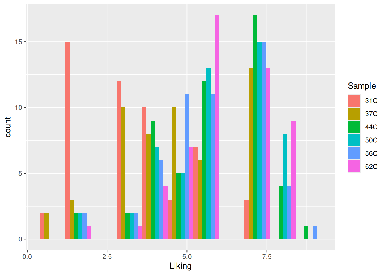
The data here are ”liking” of coffees at different temperatures, and so one might wish to infer this information in the histogram. This can be done by coloring by sample name.
ggplot(coffee, aes(Liking, fill = Sample)) +geom_histogram(position ="dodge", # Plot the colors side-by-sidebinwidth =0.8# Set the width of the bins )
Figure 5.2: A histogram of the “Liking” variable in the coffee consumer dataset. The histogram is now colored by the sample name.
Tasks
Look at figure 5.2, how does the temperature affect the liking?
If you do not want to overlay the histograms, it is possible to plot them as individual panels. Try running the following code and see what it does.
ggplot(coffee, aes(Liking)) +geom_histogram() +facet_wrap(~ Sample) # Wrap by sample
Exercise 5.2
Exercise 5.2 - Plotting distributions with densitograms
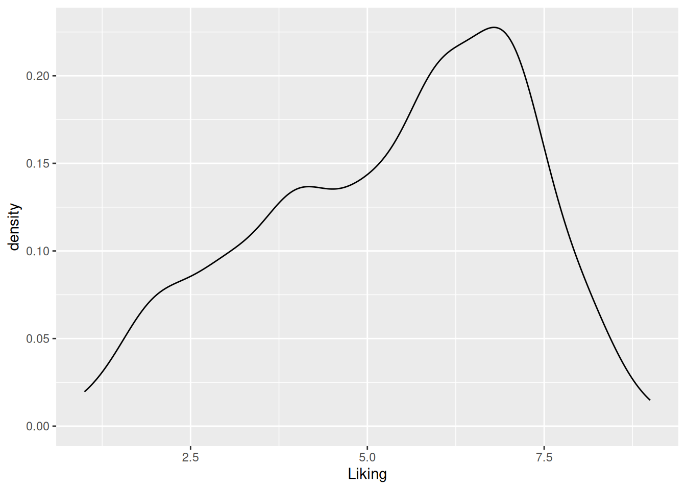
A densitogram is a smoothed extension of the histogram, and as such represents the same type of information. The bin width in the histogram controls the resolution, whereas the counterpart in the densitogram is the degree of smoothing. By changing the geom used in the ggplot call the plot is changed to a densitogram.
ggplot(coffee, aes(Liking)) +geom_density()
Figure 5.3: A densitogram of the “Liking” variable in the coffee consumer dataset.
Again, there are numerous additional arguments that can be used to modify the plot. Read the documentation and try some of them out.
Tasks
Modify the smoothing of the densitogram by changing the option adjust =
Try to make the smoothing very refined (e.g. adjust = 0.3). Does this reflect the underlying distribution? What is a suitable smoothing option for these data?
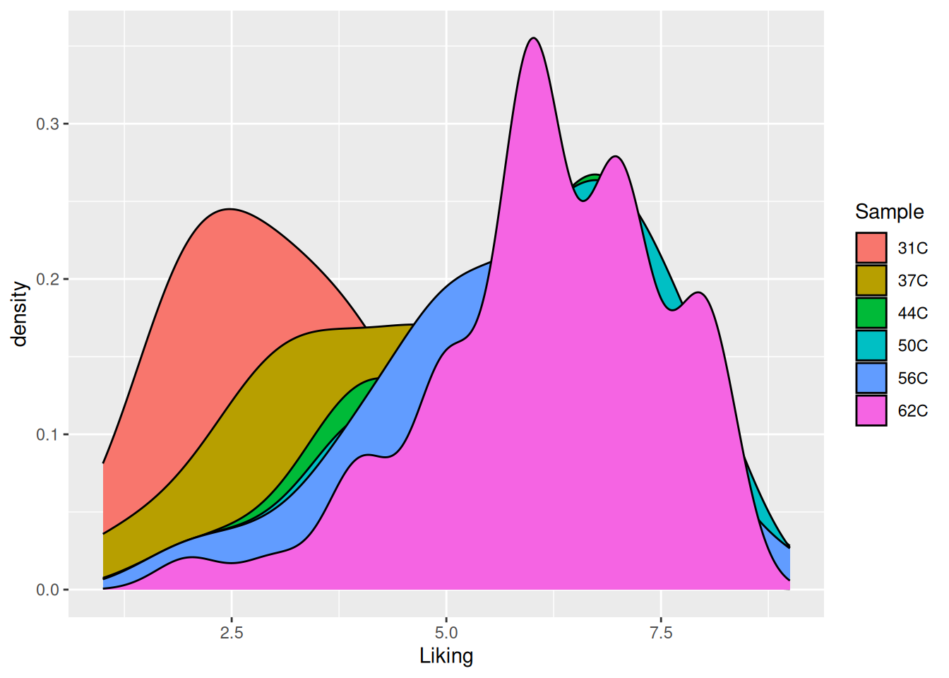
Exactly as for the histogram, it is possible to infer additional information on the densitogram.
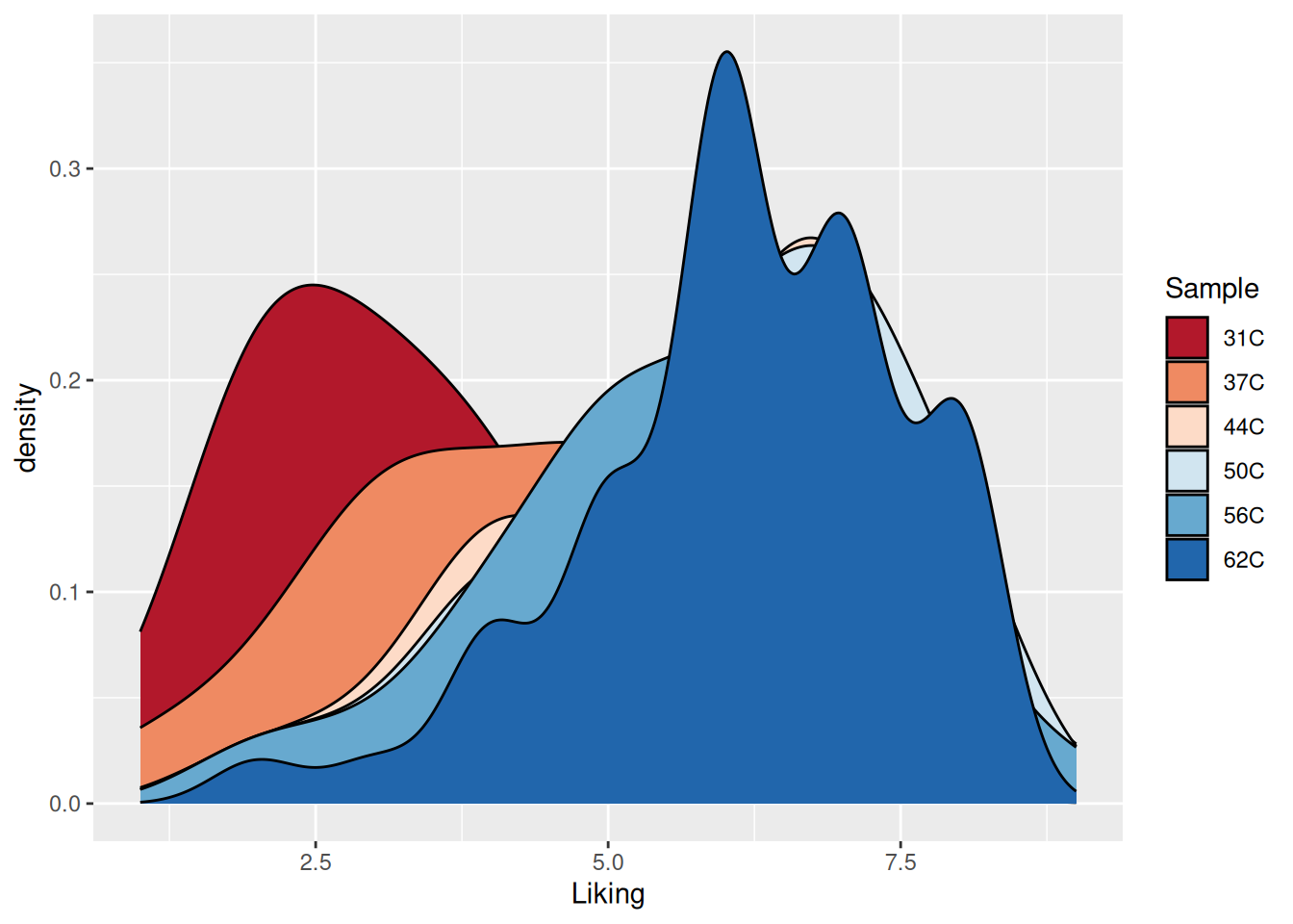
ggplot(coffee, aes(Liking, fill = Sample)) +geom_density()
Figure 5.4: A densitogram of the “Liking” variable in the coffee consumer dataset. The plot is now colored according to the “Sample” variable.
This plot is not optimal, as only the densitogram for temperature 62C is fully visible.
Tasks
Try adjusting the transparency by of the plot by setting alpha = 0.5.
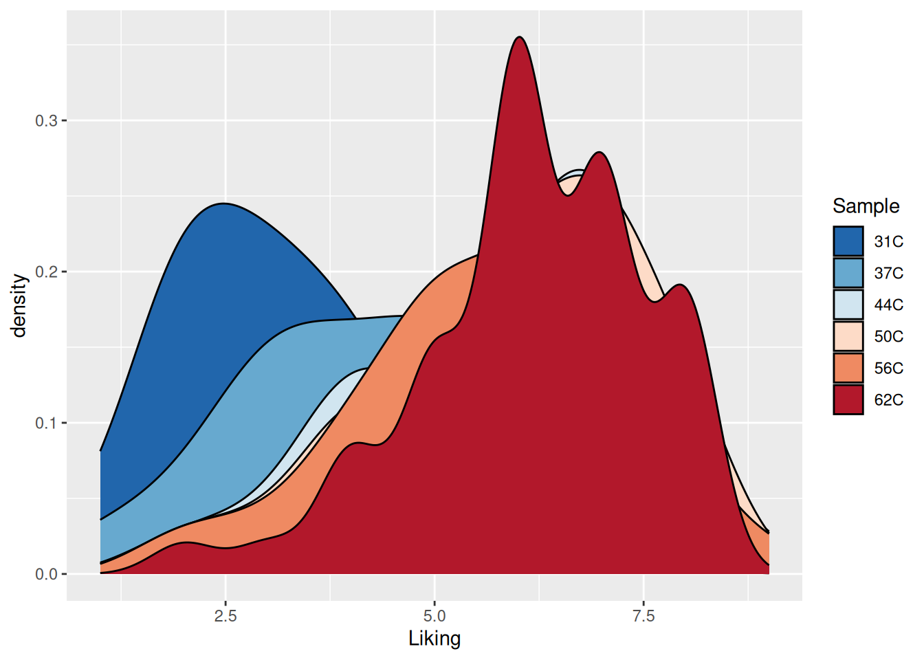
The colors used in the plot could be more intuitive as they refer to temperature. There are several ways the to add a different color scheme. One is to add a layer to the plot specifying either a predefined color scheme, a modification of a predefined color scheme or simply by specifying each of the colors used. Here we just use a predefined Red to Blue-palette from ColorBrewer.
ggplot(coffee, aes(Liking, fill = Sample)) +geom_density() +scale_fill_brewer(palette ="RdBu" )
Figure 5.5: A densitogram of the “Liking” variable in the coffee consumer dataset. The plot is now colored according to the “Sample” variable using the Red to Blue-palette from ColorBrewer.
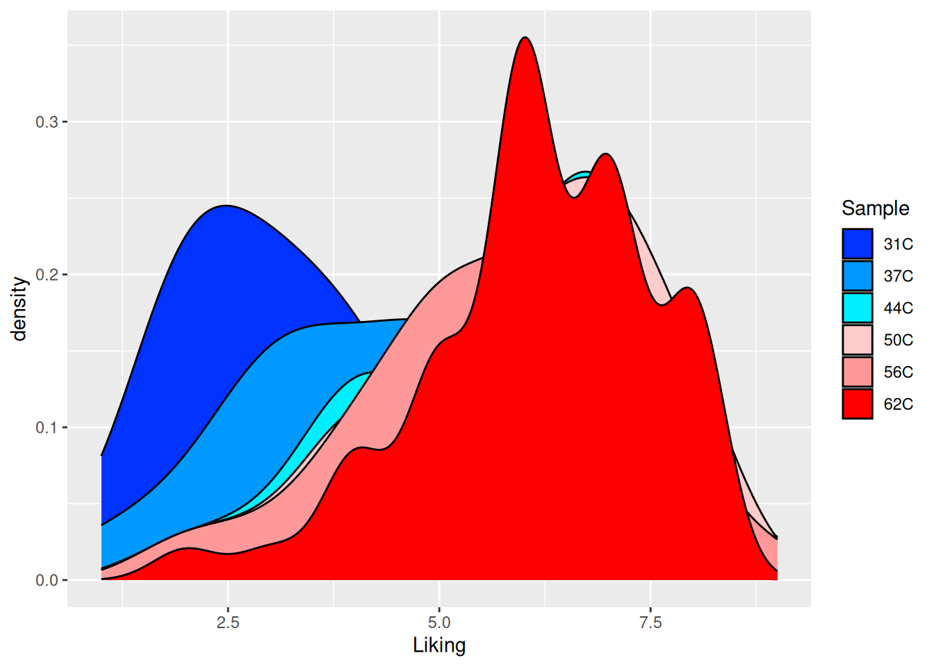
However, the colors are in a counter intuitive direction. This can easily be corrected for by adding direction = -1 to the color scheme call.
ggplot(coffee, aes(Liking, fill = Sample)) +geom_density() +scale_fill_brewer(palette ="RdBu",direction =-1 )
Figure 5.6: A densitogram of the “Liking” variable in the coffee consumer dataset. The plot is now colored according to the “Sample” variable using the Red to Blue-palette from ColorBrewer - this time in the “correct” direction.
If nothing seems to fit your ideal color-world, then you can simply specify the exact colors (HINT: try googling color codes for ggplot2 ).
Figure 5.7: A densitogram of the “Liking” variable in the coffee consumer dataset. The plot is now colored according to the “Sample” variable using manually specified colors.
Tasks
Try to reconstruct these plots, and try to use other predefined color schemes. Further all these plots suffers from lack of transparency, so fix that as well.
Exercise 5.3
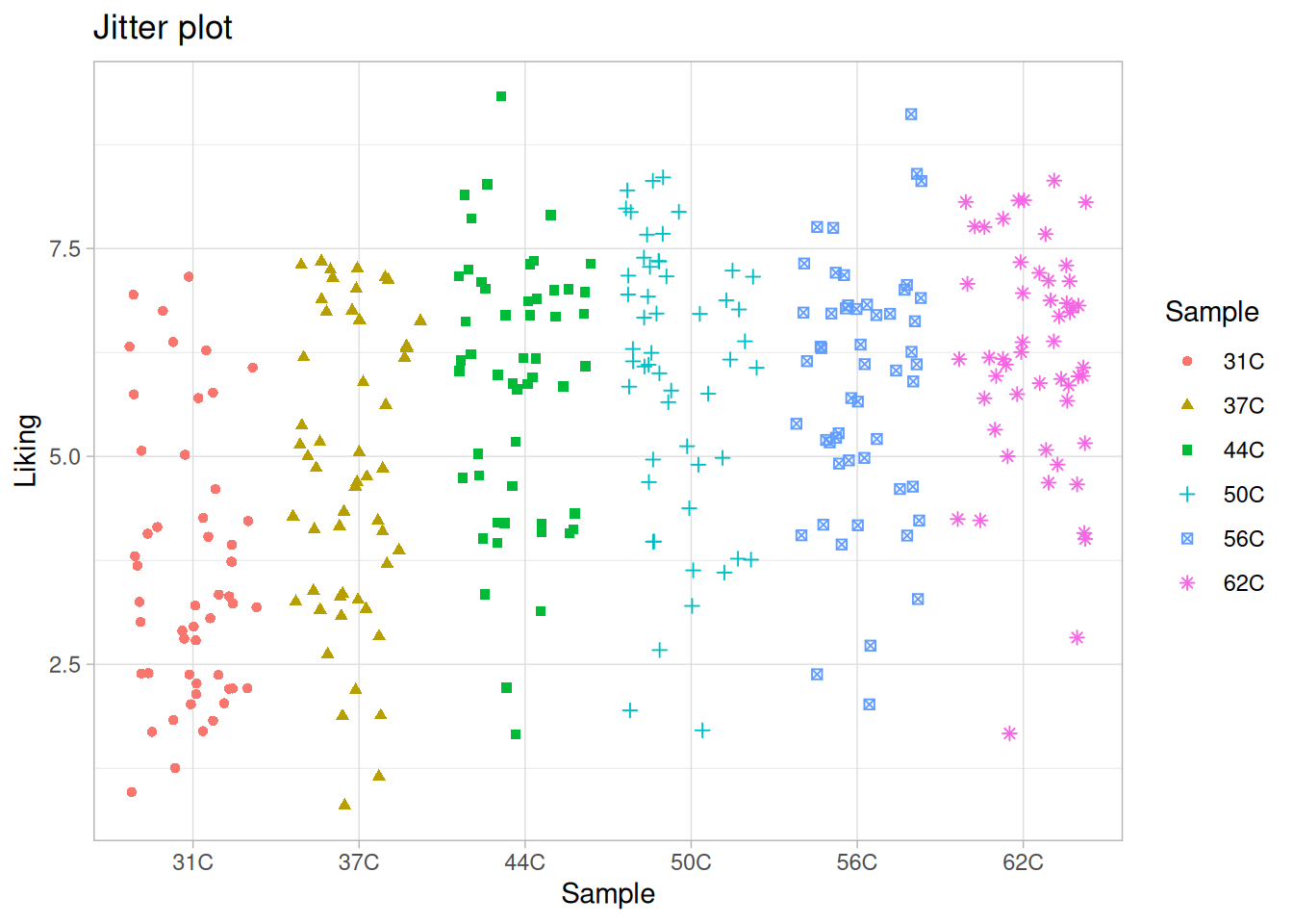
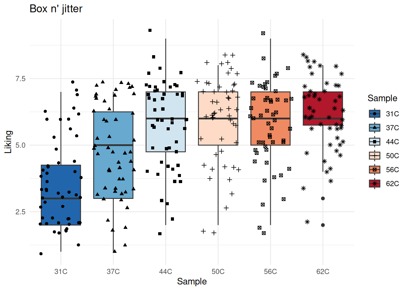
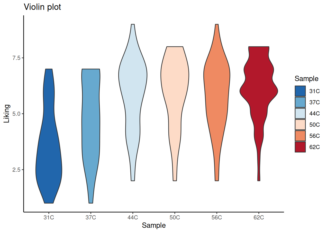
Exercise 5.3 - Boxplot, Jitterplot and Violinplot
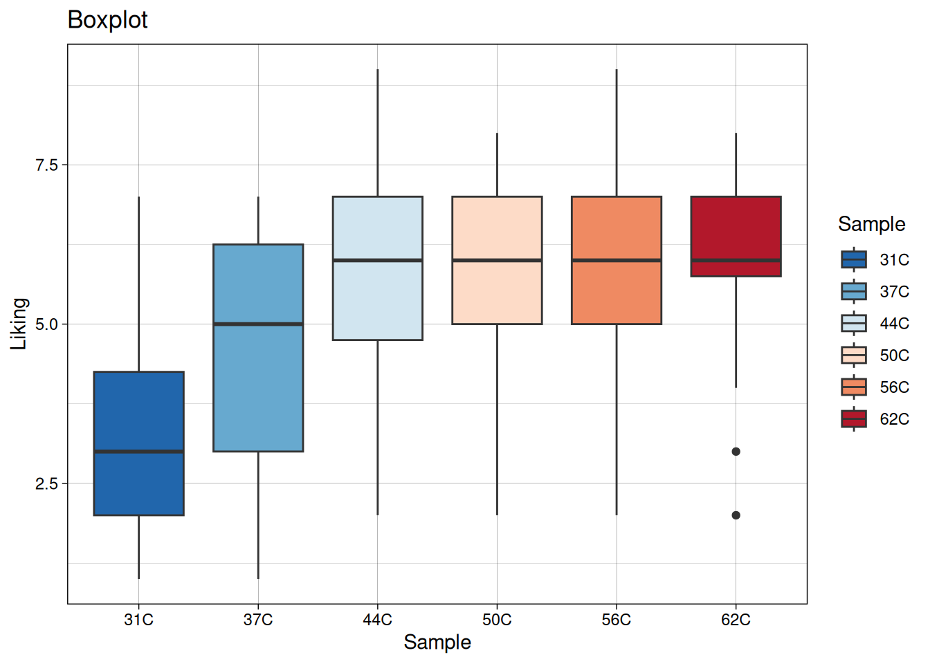
In the above, the different temperatures were infered on the plot by overlaying histograms. However, the x-axis can be used for keeping track of this information. This is especially useful when you are comparing more than four levels. The code below produces four different plots for this purpose.
Figure 5.11: A boxplot of the “Liking” variable in the coffee consumer dataset.
There are several things to notice from the plots above:
The title of a plot can be added by using labs(title = "Title goes here) or ggtitle("Title goes here).
The background, and some other stuff, of the plots are different, and is inferred by adding + theme_XXX() (the default is theme is theme_gray()).
In the boxplot the colors are added by fill = Sample and in the jitter plot the colors are added by color = Sample. This is because the the points in the jitter plot do not have a “fill” (they are not “filled” with a color).
Tasks
Try to reconstruct these plots.
The boxplot has several features, such as a box with a line in the middle, some so-called whiskers and also maybe a few actual points. Check out what these refer to in the data, and calculate them directly on data to verify that the computer is not off.
How to save plots
The plots can saved as high resolution files by using the ggsave-function. Unless otherwise specified the plots are saved in the same aspect ratio as seen in the plot window of RStudio.
# Save plot as PNG with a resoultion of 300 DPI (standard print resolution)ggsave("MyPlot.png", dpi =300) # Save plot as jpeg with a resoultion of 72 dpiggsave("MyPlot.jpeg", dpi =72) # Save plot as pdfggsave("MyPlot.pdf")
The plot is saved in the current working directory.
Sometimes it can be necessarry to play around with the scaling factor scale =. Try increasing it if the text looks too small.
Exercise 5.4
Exercise 5.4 - Analysis of coffee serving temperature - data inspection
Serving temperature of coffee seems of importance on how this drink is perceived. However, it is not totally clear how this relation is. In order to understand this, studies on the same type of coffee served at different temperature is conducted. In this exercise we are going to use the data from a trained Panel of eight judges, evaluating coffee served at six different temperatures on a set of sensorical descriptors. Each judge is presented with each temperature in a total of four replicates leading to a total of \(6 \times 8 \times 4 = 192\) samples.
In the dataset Results Panel.xlsx the results are listed. Taking these data from A to Z involves descriptive analysis for understanding variation within judge, between judge and between different temperatures, further outlier detection, and finally determination of structure between sensorical descriptors. In this exercise we are only going to briefly explore the data with emphasis on uncertainty.
This is data from a trained panel, meaning each judge have been trained to be an objective instrument returning the same response when presented the same sample. However, there is always uncertainty in such responses, and especially when the instrument is a human being. We are interested in how big the deviation is between the four replicates, across judges and samples.
Tasks
Import the data and check that it is matching the excel file using head().
Use the summarise() or aggreggate() function to extract certain descriptive measures (e.g. mean or standard deviation) from the data.
Plot this descriptive measure for a single descriptor across temperature (x-axis) and join the points from the same judge.
What can you say about the individual judges? And is scoring more difficult for higher temperature than lower?
# Compute the mean of the replicatescoffee_ag <-aggregate(coffee, by =list(coffee$Assessor, coffee$Sample), FUN = mean)# Rename some of the variables coffee_ag <-rename(coffee_ag, c(Judge = Group.1, Temp = Group.2))# Make an initial plot of the resultggplot(coffee_ag, aes(Temp, Intensity, color = Temp)) +geom_boxplot() +geom_jitter()
coffee |>group_by(Assessor, Sample) |>summarise(across(.cols =where(is.numeric), # Choose all numeric columns.fns = mean # Compute mean )) |>ggplot(aes(Temperatur, Intensity, color = Sample)) +geom_boxplot() +geom_jitter()
Source Code
# Plotting```{r}#| label: plotting setup#| echo: false#| message: false#| warning: falselibrary(ggplot2)coffee <- DAinFoodScience::coffeetempconsumer```::: {.callout-tip}## Learning objectives* Be able to produce a range of plots reflecting the raw data distribution. * That be; histogram, boxplot, jitterplot, scatterplot, lineplot, stem ’n’ leaf plot, bar chart, pie chart and spline plot. * Be able to understand how desriptive statistics are connected to theseplots. * Utilizing the various functionality to infer information on the plot, by color, markersize, transparency etc. * Optimally you will be using the ggplot2 package in R for this purpose.:::## Reading material* Chapter 1 in [Introduction to Statistics](https://02402.compute.dtu.dk/enotes/book-IntroStatistics) by Brockhoff * Especially section 1.5 to 1.6.* [ggplot2 cheat sheet](https://rstudio.github.io/cheatsheets/html/data-visualization.html?_gl=1*1djvpis*_ga*MTQ2NjY2ODI2MS4xNzI1NTQzMDM0*_ga_2C0WZ1JHG0*MTczMTM5OTYwOS4xMS4wLjE3MzEzOTk2MDkuMC4wLjA.). It is a very nice cheat sheet on how to use ggplot2. * Cheat sheets for other libraries also exist. You can find them [here](https://posit.co/resources/cheatsheets/).* Online lectures: There is a lot of how-to-plot on the web. Use it when you are getting stuck at a problem, or if you feel like being inspired. * These are nice and short: - [Charts Are Like Pasta - Data Visualization Part 1: Crash Course Statistics #5](https://www.youtube.com/watch?v=hEWY6kkBdpo). - [Plots, Outliers, and Justin Timberlake: Data Visualization Part 2: Crash Course Statistics #6](https://www.youtube.com/watch?v=HMkllhBI91Y). * This one is pretty comprehensive: - [Visualising data with ggplot2. Lecture by Hadley Wickham](https://www.mathtube.org/lecture/video/visualising-data-ggplot2). * Pat Schloss makes some really nice videos on how to reproduce published figures using ggplot2. Be aware that they are very advanced. - [Riffomonas Project](https://www.youtube.com/c/RiffomonasProject)## Plotting with ggplot2 - in short {#sec-ggplot-intro}The package `ggplot2` for R is a versatile tool for producing various plots with the option of modifying them in great detail. It is based on *layers*, which mean the you build your plots layer by layer.To create visualizations with ggplot2, you first need to load your data into R. For this example, the built-in `iris` data set is used.```{r}library(ggplot2) # Load ggplot2my_data <- iris # Loads the built-in example data set called "iris"head(my_data) # Print the first 6 rows of the datalevels(my_data$Species) # Get the levels of species```It is clear that the data consists of measurements of sepals and petals of three different species of flowers. If we want to plot the `Sepal.Length` variable against the `Sepal.Width` variable it can be done by using ggplot2 as shown below.```{r}ggplot(data = my_data, aes(x = Sepal.Length, y = Sepal.Width))```In the code above we tell ggplot that we want to plot data using the dataframe `my_data`. Furthermore, we tell it that we want `Sepal.Length` on the x-axis and `Sepal.Width` on the y-axis.There is, however, one problem: The plot above does not contain any data points. This is due to the fact that we have not added any *geometric objects* or *geoms* as they are called. The geom for points is added to the code below.```{r}ggplot(data = my_data, aes(x = Sepal.Length, y = Sepal.Width)) +# Notice the "+" signgeom_point()```Notice how the data has been "given" to the `geom_point()` call and we now see data points. If we want to add some color, we can tell ggplot2 to assign a color to each species in the data set.```{r}ggplot(data = my_data, aes(x = Sepal.Length, y = Sepal.Width, color = Species)) +geom_point(size =2)```When using ggplot2 the data given in a so called *aesthetic* which is denoted by the `aes()` inside the `ggplot()` call. An aesthetic mapping describes how to visual elements are mapped to the variables. The `aes(x = Sepal.Length, y = Sepal.Width, color = Species)` within the `ggplot()` call is passed down to all `geoms` below such that multiple layers can use the same data without having the specify it each time.```{r}ggplot(data = my_data, aes(x = Sepal.Length, y = Sepal.Width, color = Species)) +geom_point(size =2) +geom_rug() # This geom also uses the specified data```The possible settings for each geom can be found using `?geom_point()` or by letting the cursor hover in the geom name and pressing F1.### Saving plots as variablesPlots can also be saved as variables. This is often useful for more advanced plots and when you want to create different plots using loops etc.For example, the plot directly above can also be created as ```{r}plt <-ggplot(data = my_data, aes(x = Sepal.Length, y = Sepal.Width, color = Species))plt <- plt +geom_point(size =2)plt <- plt +geom_rug()```And then shown using ```{r}#| eval: falseplt # Show plot```### Saving plots from ggplotSaving plots as image or vector type formats can be done using `ggsave()`.```{r}#| eval: false# Save as png with standard settings using current aspect ratioggsave("my_plot.png")# Save the "plt" plot using standard settingsggsave("my_plot.png", plot = plt)# Save the custom width and height oc 10 x 20 cmggsave("my_plot.png", width =10, height =20, units ="cm") # Save as svg (a vector format) with standard settings using current aspect ratioggsave("my_plot.svg")```Sometimes it takes some playing around to get settings that scale nice, but it is by far the best way to export ggplot figures out of R.::: {.callout-important} The figures will be saved to your current working directory. You can see the current working directory using `getwd()`.:::## ExercisesThe package ggplot2 for R is a versatile tool for producing various plots with the option of modifying them in great detail. The following exercises should guide you through the basic functionality of the `ggplot` function and show you how you can layer different geoms to produce the plots you want.:::{.callout-note}### Before you startStart by importing a dataset and specify some necessary packages (If you have not installed them on your local drive, you might need to do so). The following lines of code will do the job, if you specify the correct [working directory](#sec-r-basics-working-directory).```{r}#| eval: false#| code-fold: false# Load package for importing Excel-fileslibrary(readxl) # Import coffee data setcoffee <-read_excel("Results Consumer Test.xlsx")```There are several ways of importing data into R, depending on which format you have them in. From excel, the `read.xls()` (from the gdata library) or `read_excel()` (from the readxl library) are two ways of doing it. In either case, make sure that the data is correctly imported, by comparing the imported data with the original - sometimes there are problems with decimals.:::Assume that you have a single response variable, for instance alcohol content of a series of various types of drinks, measurements of body weight from an nutritional experiment or content of antioxidants for a given product produced under different conditions. For all of these, the variable is continuous in form. As a starting point of every analysis an overview of the distribution of the variable of interest is crucial, and plotting the distribution facilitate insight into character of distribution (bell shaped, skewness, bi modal, zero inflated etc.) and single point information for outlier identification.::: {#ex-plotting-1}<!-- Cross-ref anchor -->::::::{.callout-exercise}### Before you startStart by loading the `ggplot2` and the `readxl` package. Use the `readxl` package to import a data that can be used for plotting. The code below will help you on your way.```{r}#| eval: false#| code-fold: false# If you have not installed the packaged below remember to do so.# install.packages("readxl")# install.packages("ggplot2")library(readxl) # Load package for importing Excel-fileslibrary(ggplot2) # Load package for plotting data# Import coffee data setcoffee <-read_excel("Results Consumer Test.xlsx")```::: {.callout-important}If you get the following error[Error: "Results Consumer Test" does not exist in current working directory"]{.code_text .red_text}or something similar, it might be due to the following things:1. You have not specified your [working directory](#sec-r-basics-working-directory) correctly.2. You misspelled the file name. Check these two first!:::### The language of ggplot2### Plotting distributions with histogramsThe histogram is the most basic representation of continuous data. A simple histogram can be produced in the following way with ggplot2.```{r}#| code-fold: false#| message: false#| label: fig-plotting-ex-histogram#| fig-cap: A simple histogram of the "Liking" variable in the coffee consumer dataset.ggplot(data = coffee, aes(Liking)) +geom_histogram()```There are numerous additional arguments that can be used to modify this plot. Check out the documentation or google it to see how it is done. The documentation can be found by running `?geom_histogram()` or by having the text cursor in the function name while pressing F1.:::{.callout-task}1. Change the color of the bars2. Change the bin width.3. Change the transparency of the bars (aka. `alpha`-value).4. Add a title to the plot.:::The data here are ”liking” of coffees at different temperatures, and so one might wish to infer this information in the histogram. This can be done by coloring by sample name.```{r}#| code-fold: false#| label: fig-plotting-ex-histogram-color#| fig-cap: A histogram of the "Liking" variable in the coffee consumer dataset. The histogram is now colored by the sample name. ggplot(coffee, aes(Liking, fill = Sample)) +geom_histogram(position ="dodge", # Plot the colors side-by-sidebinwidth =0.8# Set the width of the bins )```:::{.callout-task}5. Look at @fig-plotting-ex-histogram-color, how does the temperature affect the liking?:::If you do not want to overlay the histograms, it is possible to plot them as individual panels. Try running the following code and see what it does.```{r}#| code-fold: false#| eval: falseggplot(coffee, aes(Liking)) +geom_histogram() +facet_wrap(~ Sample) # Wrap by sample```:::::: {#ex-plotting-2}<!-- Cross-ref anchor -->::::::{.callout-exercise}### Plotting distributions with densitogramsA densitogram is a smoothed extension of the histogram, and as such represents the same type of information. The bin width in the histogram controls the resolution, whereas the counterpart in the densitogram is the degree of smoothing. By changing the geom used in the ggplot call the plot is changed to a densitogram. ```{r}#| code-fold: false#| label: fig-plotting-ex-densitogram#| fig-cap: A densitogram of the "Liking" variable in the coffee consumer dataset.ggplot(coffee, aes(Liking)) +geom_density()```Again, there are numerous additional arguments that can be used to modify the plot. Read the documentation and try some of them out.:::{.callout-task}1. Modify the smoothing of the densitogram by changing the option `adjust =`2. Try to make the smoothing very refined (e.g. `adjust = 0.3`). Does this reflect the underlying distribution? What is a suitable smoothing option for these data?:::Exactly as for the histogram, it is possible to infer additional information on the densitogram.```{r}#| code-fold: false#| label: fig-plotting-ex-densitogram-color#| fig-cap: A densitogram of the "Liking" variable in the coffee consumer dataset. The plot is now colored according to the "Sample" variable.ggplot(coffee, aes(Liking, fill = Sample)) +geom_density()```This plot is not optimal, as only the densitogram for temperature 62C is fully visible.:::{.callout-task}3. Try adjusting the transparency by of the plot by setting `alpha = 0.5`.:::The colors used in the plot could be more intuitive as they refer to temperature. There are several ways the to add a different color scheme. One is to add a layer to the plot specifying either a predefined color scheme, a modification of a predefined color scheme or simply by specifying each of the colors used. Here we just use a predefined *Red to Blue*-palette from [ColorBrewer](https://colorbrewer2.org/#type=sequential&scheme=BuGn&n=3).```{r}#| code-fold: false#| label: fig-plotting-ex-densitogram-rdbu#| fig-cap: A densitogram of the "Liking" variable in the coffee consumer dataset. The plot is now colored according to the "Sample" variable using the *Red to Blue*-palette from ColorBrewer.ggplot(coffee, aes(Liking, fill = Sample)) +geom_density() +scale_fill_brewer(palette ="RdBu" )```However, the colors are in a counter intuitive direction. This can easily be corrected for by adding `direction = -1` to the color scheme call. ```{r}#| code-fold: false#| label: fig-plotting-ex-densitogram-rdbu-rev#| fig-cap: A densitogram of the "Liking" variable in the coffee consumer dataset. The plot is now colored according to the "Sample" variable using the *Red to Blue*-palette from ColorBrewer - this time in the "correct" direction.ggplot(coffee, aes(Liking, fill = Sample)) +geom_density() +scale_fill_brewer(palette ="RdBu",direction =-1 )```If nothing seems to fit your ideal color-world, then you can simply specify the exact colors (HINT: try googling color codes for ggplot2 ).```{r}#| code-fold: false#| label: fig-plotting-ex-densitogram-custom-colors#| fig-cap: A densitogram of the "Liking" variable in the coffee consumer dataset. The plot is now colored according to the "Sample" variable using manually specified colors.custom_colormap <-c("#0033FF", "#0099FF","#00EEFF", "#FFCCCC", "#FF9999","#FF0000")ggplot(coffee, aes(Liking, fill = Sample)) +geom_density() +scale_fill_manual(values = custom_colormap )```:::{.callout-task}4. Try to reconstruct these plots, and try to use other predefined color schemes. Further all these plots suffers from lack of transparency, so fix that as well.::::::::: {#ex-plotting-3}<!-- Cross-ref anchor -->::::::{.callout-exercise}### Boxplot, Jitterplot and ViolinplotIn the above, the different temperatures were infered on the plot by overlaying histograms. However, the x-axis can be used for keeping track of this information. This is especially useful when you are comparing more than four levels. The code below produces four different plots for this purpose.```{r}#| code-fold: false#| label: fig-plotting-ex-boxplot#| fig-cap: A boxplot of the "Liking" variable in the coffee consumer dataset.ggplot(coffee, aes(Sample, Liking, fill = Sample)) +geom_boxplot() +scale_fill_brewer(palette ="RdBu",direction =-1 ) +labs(title ="Boxplot") +theme_linedraw()``````{r}#| code-fold: false#| label: fig-plotting-ex-jitter#| fig-cap: A jitter plot of the "Liking" variable in the coffee consumer dataset.ggplot(data = coffee, aes(Sample, Liking, color = Sample, shape = Sample)) +geom_jitter() +labs(title ="Jitter plot") +theme_light()``````{r}#| code-fold: false#| label: fig-plotting-ex-box-jitter#| fig-cap: A box n' jitter plot of the "Liking" variable in the coffee consumer dataset.ggplot(data = coffee, aes(Sample, Liking, fill = Sample, shape = Sample)) +geom_boxplot() +geom_jitter() +scale_fill_brewer(palette ="RdBu",direction =-1 ) +labs(title ="Box n' jitter") +theme_minimal()``````{r}#| code-fold: false#| label: fig-plotting-ex-violin#| fig-cap: A boxplot of the "Liking" variable in the coffee consumer dataset.ggplot(data = coffee, aes(Sample, Liking, fill = Sample, shape = Sample)) +geom_violin() +scale_fill_brewer(palette ="RdBu",direction =-1 ) +labs(title ="Violin plot") +theme_classic()```There are several things to notice from the plots above:* The title of a plot can be added by using `labs(title = "Title goes here)` or `ggtitle("Title goes here)`.* The background, and some other stuff, of the plots are different, and is inferred by adding + `theme_XXX()` (the default is theme is `theme_gray()`).* In the boxplot the colors are added by `fill = Sample` and in the jitter plot the colors are added by `color = Sample`. This is because the the points in the jitter plot do not have a "fill" (they are not "filled" with a color). ::: {.callout-task}1. Try to reconstruct these plots.2. The boxplot has several features, such as a box with a line in the middle, some so-called whiskers and also maybe a few actual points. Check out what these refer to in the data, and calculate them directly on data to verify that the computer is not off.::::::{.callout-note}#### How to save plotsThe plots can saved as high resolution files by using the `ggsave`-function.Unless otherwise specified the plots are saved in the same aspect ratio as seen in the plot window of RStudio. ```{r}#| code-fold: false#| eval: false# Save plot as PNG with a resoultion of 300 DPI (standard print resolution)ggsave("MyPlot.png", dpi =300) # Save plot as jpeg with a resoultion of 72 dpiggsave("MyPlot.jpeg", dpi =72) # Save plot as pdfggsave("MyPlot.pdf") ```The plot is saved in the current working directory. Sometimes it can be necessarry to play around with the scaling factor `scale =`. Try increasing it if the text looks too small.::::::::: {#ex-analysis-of-coffee-inspection}<!-- Cross-ref anchor -->:::::: {.callout-exercise}### Analysis of coffee serving temperature - data inspectionServing temperature of coffee seems of importance on how this drink is perceived. However, it is not totally clear how this relation is. In order to understand this, studies on the same type of coffee served atdifferent temperature is conducted. In this exercise we are going to use the data from a trained Panel of eight judges, evaluating coffee served at six different temperatures on a set of sensorical descriptors. Each judge is presented with each temperature in a total of four replicates leading to a total of $6 \times 8 \times 4 = 192$ samples.In the dataset *Results Panel.xlsx* the results are listed. Taking these data from A to Z involves descriptive analysis for understanding variation within judge, between judge and between different temperatures, further outlier detection, and finally determination of structure between sensorical descriptors. In this exercise we are only going to briefly explore the data with emphasis on uncertainty.This is data from a trained panel, meaning each judge have been trained to be an objective instrument returning the same response when presented the same sample. However, there is always uncertainty in suchresponses, and especially when the instrument is a human being. We are interested in how big the deviation is between the four replicates, across judges and samples.::: {.callout-task}1. Import the data and check that it is matching the excel file using `head()`.2. Use the `summarise()` or `aggreggate()` function to extract certain descriptive measures (e.g. mean or standard deviation) from the data.3. Plot this descriptive measure for a single descriptor across temperature (x-axis) and join the points from the same judge.4. What can you say about the individual judges? And is scoring more difficult for higher temperature than lower?:::The code below does (some) of the job.::: {.panel-tabset}#### Classic R```{r}#| eval: false# Compute the mean of the replicatescoffee_ag <-aggregate(coffee, by =list(coffee$Assessor, coffee$Sample), FUN = mean)# Rename some of the variables coffee_ag <-rename(coffee_ag, c(Judge = Group.1, Temp = Group.2))# Make an initial plot of the resultggplot(coffee_ag, aes(Temp, Intensity, color = Temp)) +geom_boxplot() +geom_jitter()```#### Tidyverse ```{r}#| eval: falsecoffee |>group_by(Assessor, Sample) |>summarise(across(.cols =where(is.numeric), # Choose all numeric columns.fns = mean # Compute mean )) |>ggplot(aes(Temperatur, Intensity, color = Sample)) +geom_boxplot() +geom_jitter()```::::::