Be able to compute the correlation between two variables.
Know the relation between covariance and correlation.
Comprehend that the correlation structure between variables is a key component in most pattern recognition techniques, and is a driver for the PCA analysis.
Be able to visualize the correlation between two variables, and use this for judging whether the correlation coefficient is a valid representation for this relation.
Visualize pairwise correlations for multivariate data.
Know the relation between the PCA loading plot and bi-variate scatterplot.
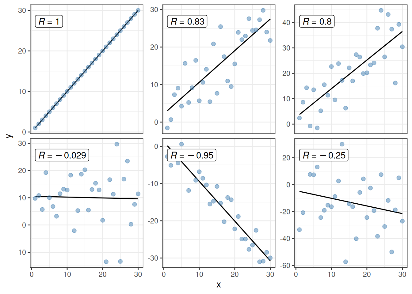
A covariance or correlation is a scalar measure for the association between two (response-) variables. Covariance bewteen two variables \(X = (x_1, x_2, ..., x_n)\) and \(Y = (y_1, y_2, ..., y_n)\) is defined as:
Figure 7.1: Correlation \(R\) between one variable x and different y variables.
Example 7.1
Example 7.1 - Natural phenolic antioxidants for meat preservation - Correlation
This example continues where we left of in Example 6.1 with the sensory data on the meat sausages treated with green tea (GT) and rosemary extract (RE) or control.
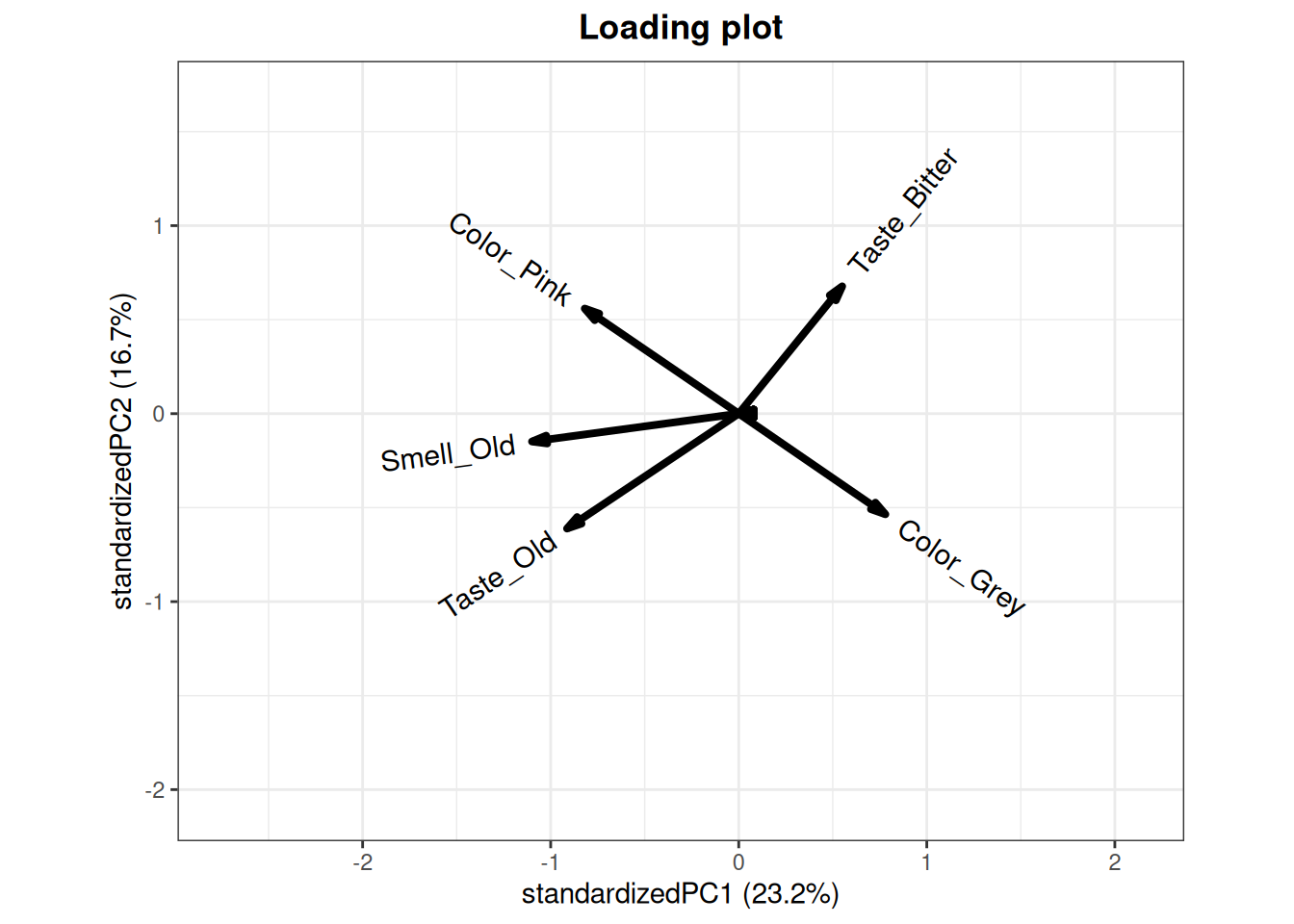
Figure 7.2: Select loadings from the PCA model computed in the previous example.
In figure 7.2 the loading plot corresponding to some of the loadings found in the PCA model calculated in the previous example is shown. The selected variables show positive, negative and non-correlated loadings. In a PCA loading plot, loadings with opposite directions are negatively correlated, while loadings pointing in the same direction are possitively correlated. Loadings which are orthogonal (90 degree angle) with respect to each other, are not correlated. For the plot above, this means that:
Taste_Old and Smell_Old are positively correlated.
Taste_Bitter and Color_Pink are uncorrelated.
Color_Pink and Color_Grey are negatively correlated.
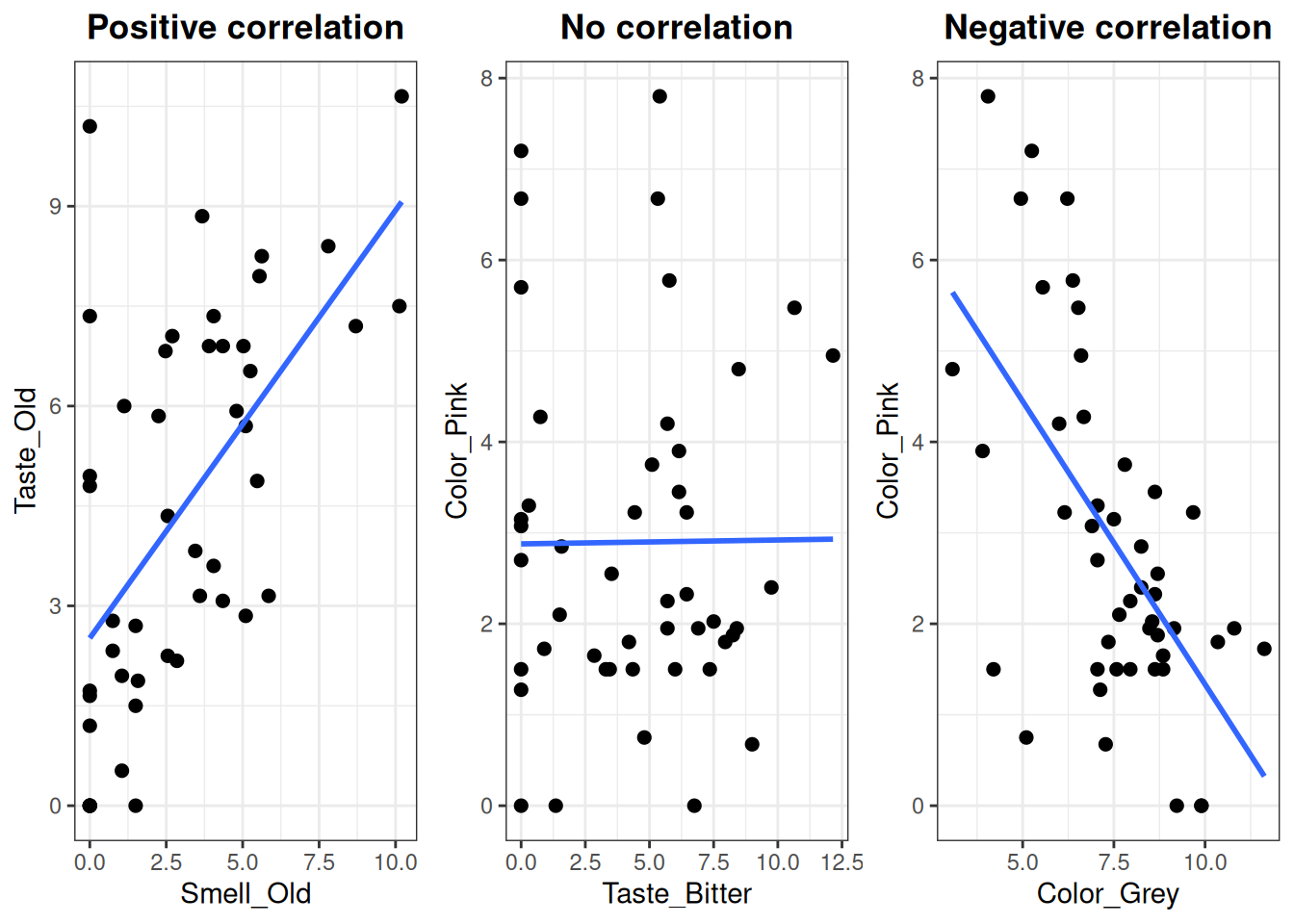
To check if the correlation holds for the raw data, scatter plots are made for each of the encircled three examples. (Note that the interpretation of these correlations are only valid with respect to the variation described in the model)
Create scatter plots
# Define a common thememy_theme <-theme_bw() +theme(plot.title =element_text(hjust = .5, face ="bold"))# Plot 1plt1 <-ggplot(X, aes(Smell_Old, Taste_Old)) +geom_point(size =2) +stat_smooth(method ="lm", se = F) +ggtitle("Positive correlation") + my_theme# Plot 2plt2 <-ggplot(X, aes(Taste_Bitter, Color_Pink)) +geom_point(size =2) +stat_smooth(method ="lm", se = F) +ggtitle("No correlation") + my_theme# Plot 3plt3 <-ggplot(X, aes(Color_Grey, Color_Pink)) +geom_point(size =2) +stat_smooth(method ="lm", se = F) +ggtitle("Negative correlation") + my_theme# Arrange the plots in a 1 x 3 grid (requires gridExtra package)grid.arrange(plt1, plt2, plt3, ncol =3)
Figure 7.3: The between three pairs of select variables from the meat data.
The correlation values are calculated using the cor() function.
# Calculate correlationcor1 <-cor(X$Smell_Old, X$Taste_Old)cor2 <-cor(X$Taste_Bitter, X$Color_Pink)cor3 <-cor(X$Color_Grey, X$Color_Pink)# Display in a fancy waycat("Correlation coefficients","\n Smell_Old vs Taste_Old: \t\t", cor1,"\n Taste_Bitter vs Color_Pink: \t", cor2,"\n Color_Grey vs Color_Pink: \t\t", cor3)
Correlation coefficients
 Smell_Old vs Taste_Old:         0.595475
 Taste_Bitter vs Color_Pink:     0.007446373
 Color_Grey vs Color_Pink:       -0.604673
Conclusions
Here, it can be seen that the pink and grey color attributes, which are oppositely directed in the PCA loadings, display a moderate negative correlation in the raw data. The pink color and bitter taste, which are orthogonal to each other in the loadings, are not correlated at all. The old smell and old taste with similar directionality in the PCA are moderately postively correlated. With regards to food chemistry, do you think these conclusions make sense?
Exercise 7.1 - Correlation between aroma compounds
Correlation
Tasks
What does a correlation coefficient of -1, 0 or +1 tell you?
In the table below (table 7.1) the amount of Nonanal and Ethyl.2.methyl.propanoate in the six Argentine wines are listed. Fill out the blank spaces in the table and calculate the correlation coefficient (r).
Make a plot with Nonanal vs. Ethyl.2.methyl.propanoate and calculate the correlation coefficient in R (use the function cor() in R). Include only wines from Argentina.
Calculate the correlation coefficient for a, b, c and d, where you include wine data from all the countries.
Diethyl.succinate and Ethyl.lactate
Ethyl.acetate and Ethanol
2.Butanol and Ethyl.hexanoate
Benzaldehyde and Hexyl.acetate
What happens with the covariance and correlation if we multiply the Diethyl.succinate amount with 10 or −4?
What happens with the covariance and correlation if we add 10 or 100 to the Diethyl.succinate amount?
PCA
Tasks
Make a PCA including wines from all the countries (similar to the one from week 1 on the same dataset).
Which variables are responsible for the grouping of the countries?
Compare the calculated correlation coefficients in question 4 with the loading plot of the PCA in question 5.
How does the position of the variables in the loading plot make the correlation coefficients negative, positive, close to \(\pm\) 1 or 0?
Exercise 7.2
Exercise 7.2 - Covariance and Correlation - by hand
Certain types of characteristics ”go together”, for instance will a variable that measures the chocolate smell of some food type be related to a variable measuring the chocolate taste of the same food type. We talk about these two types of information being correlated. Below (table 7.2) is 48 corresponding measures of the sensorical attributes sour and roasted for coffees at different serving temperatures and different judges (each based on the average of four measurements). Calculate the correlation between these two variables based on the metrics listed below.
Table 7.2: Ratings of the sensorical attributes sour and roasted for coffees at different serving temperatures and different judges (each based on the average of four measurements).
Observation
Sour
Roasted
1
1.70
1.06
2
1.93
1.10
3
3.59
3.87
4
2.30
1.86
\(\vdots\)
\(\vdots\)
\(\vdots\)
45
1.30
1.89
46
0.26
1.93
47
1.12
1.05
48
3.84
5.41
\(\sum\)
91.59
76.42
\(\hat{\sigma}^2\)
0.90
0.94
\(\sum_{XY}\)
172.73
Tasks
Calculate mean and standard deviation for the two variables using the statistics listed below data. That is WITHOUT importing data into the computer!
The covariance between the variables is 0.57. Calculate the correlation between the two variables.
What happens with the covariance and correlation if we multiply the Sour ratings with 2 or -3?
What happens with the covariance and correlation if we add 10 or -1234 to the Roasted ratings?
As an upcoming coffee expert, why do you think these two attributes are correlated?
HARD! Calculate \(\sum (X - \bar{X})(Y - \bar{Y})\) from \(\sum XY\), \(\sum X\) and \(\sum Y\) (where X is Sour and Y is Roasted).
Hint: You need to multiply out the product of the two parenthesis and reduce the resulting part using the relation between \(\bar{X} = \sum(X) / n\).
Exercise 7.3 - Correlation and PCA
In this exercise the sensorical data from ranking of coffee served at different temperatures are used. The aim is to see how correlations is the vehicle for PCA analysis. The data is named “Results Panel.xlsx”.
Tasks
Import the data and remove the replicate effect by averaging over these.
Make a scatter plot of the attribute Sour versus Roasted. Comment on what you see in terms of relation between these two variables.
Now make a comprehensive figure where all the sensorical attributes (there are 8) are plotted against each other.
Calculate all the pairvise correlations between the variables. How does this correspond with the figure?
Make a PCA model on this dataset (same as in Exercise 5.4).
Comment on the (dis-)similarity between the correlation matrix, the multiple pairwise scatterplot and the PCA model.
Below is some code which might be useful for this purpose (You need to install or add dependencies via install.packages(GGally) or library(GGally) in order for the functions to be recognized by R). In the pairwise scatterplot a straight line is added by + geom_abline(), try also to add a smooth curve by + geom_smooth(). What are the difference between those two representation of similarity between the variables?
Quick detection of adulteration of oils is of growing importance, since high quality oils, such as olive oil, are becoming increasingly popular and expensive, increasing the incentive for adulterating with cheaper oils. Spectroscopic techniques are the preferred measurement choice because they are quick, often non-destructive and in many cases highly selective for oil characterization.
The purpose of this exercise is to introduce you to how multivariate techniques, such as PCA, can be applied on spectral datasets. They are in fact, very useful on datasets such as these, because of the very high number of variables that can be included in the modelling.
The samples in this dataset are mixtures of olive oil and thistle oil. Olive oil and thistle oil are almost exclusively made up of triglycerides, consisting of a glycerol backbone with three fatty acid chains attached. An example of a triglyceride is shown in the top right of figure 7.4 (a). Fatty acids are characterized by the amount of unsaturation. Olive oil consists mostly of monounsaturated fatty acids, while thistle oil is largely comprised of polyunsaturated fatty acids (ie: they have more double bonds). Additionally a few of the samples were spiked with a free trans fatty acid. The structure of the added trans fatty acid is shown in the top left of figure 7.4 (a).
The samples were measured with infrared (IR) spectroscopy. Some of the relevant peaks for oil characterization are shown in the raw spectra in figure 7.4 (a). The dataset consists of 30 oil samples and 1794 variables. The first 1790 variables are the absorbance at 1790 wavelengths. The last 4 columns in the dataset describe the concentration of olive oil, thistle oil and transfat, and lastly the sample ID.
Since it is a bit more difficult to work with spectral data in R, we have decided to be merciful and give you the data directly as an .RData file, which you simply get into R by load("OliveOilAdult.RData"). Be sure to be in the correct working directory, or add the path to the load command.
(a) Top right) Triglyceride. Left part: Glycerol backbone. Right part from top to bottom: Unsaturated, monounsaturated and polyunsaturated fatty acid. Top left) Trans fatty acid. Bottom) Raw IR spectrum of mixed oil.
Tasks
Load the “oliveoil” dataset in R. To be able to plot the raw spectral data, run the following R code. Use the dim() command to understand the difference between input and output to melt() on how the data is organised in the two formats.
library(reshape2)# Melt before plottingfor_raw <-melt(Oliveoil, id.vars =c("sample_id", "oliveoil", "thistleoil", "transfat"))# Define correct x-axis with wavelength vectorfor_raw$wl <-sort(rep(wl, nrow(Oliveoil)))
Tasks
Now make a plot of the raw data. Use the R-code below as a base, and customize it to your liking. Use the handy plotly package to plot an interactive plot that we can zoom in.
library(ggplot2)library(plotly)raw <-ggplot(for_raw, aes(wl, value, group = sample_id)) +geom_line()ggplotly(raw)
Tasks
Inspect the raw data plot.
How does the raw data look? Are there any outliers? in ggplotly you can identify specific samples by hovering the curser over them.
Try to color according to the different types of oil, one at a time. Then, zoom in on some of the peaks highlighted in figure 7.4 (a). Can you observe a correlation between these peaks and the oil concentration?
Now that you have a feel for the raw data, try to estimate the scores and loadings for a PCA model. Why do we only center, and not autoscale the spectral data?
Using ggplot() and ggplotly(), make a plot of the PC1 vs PC2 scores, and color according to oliveoil content.
Make two separate loading plots with first PC1 loads vs the wavelength (wl) vector and then PC2 loads vs. the wavelength. It is very important that the loadings are plotted separately, and not against each other when working with spectral data. Can you see why?
Inspect the scoreplot. Are there any outlying samples? If so, identify them. Did you notice this outlier in the raw spectra plot? Remove the outlier by using the code below and inserting the correct sample id number.
# Remove outlierOliveoil <- Oliveoil[-c(" insert outlier ID number here"), ]
Tasks
Now rerun your whole script and see how the removal of the outlier has changed the score and loading plots.
Using the score plot, try to colour them by different oil types and elucidate what information about the samples is being described by the first and second PCA component, respectively.
Inspect the loading plots and compare them to the information in figure 7.4 (a). Can you re-find some of the important peaks in the loadings? And how does this relate to the findings in the scoreplot?.
Hint: Remember that the dataset is mean centred, so the peaks will be positive or negative. Negative scores have a high absorbance in the negative loading ”peaks”, and positive scores have a high absorbance in the positive loading ”peaks”.
Exercise 7.4
Source Code
```{r}#| label: correlation setup#| echo: false#| message: false#| warning: falselibrary(dplyr)library(tidyr)library(ggpubr)library(ggbiplot)library(gridExtra)library(here)```# Correlation::: {.callout-tip}## Learning objectives* Be able to compute the correlation between two variables.* Know the relation between covariance and correlation.* Comprehend that the correlation structure between variables is a key component in most pattern recognition techniques, and is a driver for the PCA analysis.* Be able to visualize the correlation between two variables, and use this for judging whether the correlation coefficient is a valid representation for this relation.* Visualize pairwise correlations for multivariate data.* Know the relation between the PCA loading plot and bi-variate scatterplot.:::## Reading material* [Correlation and covariance - in short](#sec-correlation-intro)* Videos on correlation and covariance * [Covariance, clearly explained](#sec-covariance-clearly-explained) * [Pearson's correlation, clearly explained](#sec-pearsons-correlation-clearly-explained) * [Correlation Doesn't Equal Causation: Crash Course Statistics #8](#sec-correlation-doesnt-equal-causation) * [What is correlation?](#sec-what-is-correlation)* Chapter 1.4.3 and 2.5 of [*Introduction to Statistics*](https://02402.compute.dtu.dk/enotes/book-IntroStatistics) by Brockhoff* Chapter 2 in [*Biological Data analysis and Chemometrics*](https://27411.compute.dtu.dk/enotes/02_-_Principal_Component_Analysis_in_R) by Brockhoff## Correlation and covariance - in short {#sec-correlation-intro}A covariance or correlation is a scalar measure for the association between two (response-) variables. Covariance bewteen two variables $X = (x_1, x_2, ..., x_n)$ and $Y = (y_1, y_2, ..., y_n)$ is defined as:$$\text{cov}_{XY} = \frac{\sum_{i=1}^{n} (x_i - \bar{x})(y_i - \bar{y})}{n - 1}$$Covariance depends on the scale of data ($X$ and $Y$), and as such is hard to interpret.The correlation is however a scale in-variant version$$\text{corr}_{XY} = \frac{\text{cov}_{XY}}{s_X \cdot s_Y},$$where $s_X$ and $s_Y$ are the standard deviation for $X$ and $Y$ respectively (see @sec-estimation-of-parameters for details).Dividing the covariance by the individual standard deviations put the correlation coefficient in the range between −1 and 1$$-1 \leq \text{corr}_{XY} \leq 1. $$A correlation (and covariance) close to zero indicates that there are no association between the two variables (see @fig-correlation-example).```{r}#| label: fig-correlation-example#| fig-cap: Correlation $R$ between one variable x and different y variables.#| code-fold: true#| message: falseset.seed(4321)x <-1:30n <-length(x)data.frame("x"= x,"y1"= x,"y2"= x +rnorm(n, sd =6),"y3"= x +rnorm(n, sd =10),"y4"=rep(11, n) +rnorm(n, sd =10),"y5"=-x +rnorm(n, sd =3),"y6"=-x +rnorm(n, sd =20)) |>pivot_longer(cols =!x) |>ggplot(aes(x, value)) +geom_smooth(method ="lm", se = F, linewidth = .6, color ="black") +geom_point(size =2, color ="steelblue", alpha = .5) +stat_cor(aes(label =after_stat(r.label)),geom ="label", ) +labs(y ="y") +facet_wrap(~ name, scales ="free_y") +theme_bw() +theme(strip.background =element_blank(),strip.text =element_blank() )```::: {#exa-phenolic-antiox-correlation}<!-- Cross-ref anchor -->:::::: {.callout-example}### Natural phenolic antioxidants for meat preservation - Correlation```{r}#| label: correlation example 1 setup#| echo: false#| message: false#| warning: falseload(here("data", "meat_data.RData"))```This example continues where we left of in @exa-phenolic-antiox-pca with the sensory data on the meat sausages treated with green tea (GT) and rosemary extract (RE) or control.**Load the data and libraries**Remember to set your [working directory](#sec-r-basics-working-directory).```{r}#| eval: false#| code-line-numbers: falselibrary(ggplot2)library(gridExtra) # For showing multiple plots in a gridload("meat_data.RData")``````{r}#| label: fig-meat-loadings-example#| fig-cap: Select loadings from the PCA model computed in the previous example.#| code-fold: true#| warning: falsepca <-prcomp(X[,3:20], center =TRUE, scale. =TRUE)# Define loadings to keepshow_loadings <-c("Color_Pink", "Smell_Old", "Taste_Old", "Taste_Bitter", "Color_Grey")# Remove loadingspca$rotation[!rownames(pca$rotation) %in% show_loadings, ] <-0ggbiplot(pca,select =rownames(pca$rotation) %in% show_loadings,alpha =0, varname.size =4) +labs(title ="Loading plot") +theme_bw() +theme(plot.title =element_text(hjust = .5, face ="bold"))```In @fig-meat-loadings-example the loading plot corresponding to some of the loadings found in the PCA model calculated in the previous example is shown. The selected variables show positive, negative and non-correlated loadings. In a PCA loading plot, loadings with opposite directions are negatively correlated, while loadings pointing in the same direction are possitively correlated. Loadings which are orthogonal (90 degree angle) with respect to each other, are not correlated. For the plot above, this means that:* *Taste_Old* and *Smell_Old* are positively correlated. * *Taste_Bitter* and *Color_Pink* are uncorrelated. * *Color_Pink* and *Color_Grey* are negatively correlated.To check if the correlation holds for the raw data, scatter plots are made for each of the encircled three examples. (Note that the interpretation of these correlations are only valid with respect to the variation described in the model)**Create scatter plots** ```{r}#| label: fig-meat-correlation#| fig-cap: The between three pairs of select variables from the meat data.#| message: false# Define a common thememy_theme <-theme_bw() +theme(plot.title =element_text(hjust = .5, face ="bold"))# Plot 1plt1 <-ggplot(X, aes(Smell_Old, Taste_Old)) +geom_point(size =2) +stat_smooth(method ="lm", se = F) +ggtitle("Positive correlation") + my_theme# Plot 2plt2 <-ggplot(X, aes(Taste_Bitter, Color_Pink)) +geom_point(size =2) +stat_smooth(method ="lm", se = F) +ggtitle("No correlation") + my_theme# Plot 3plt3 <-ggplot(X, aes(Color_Grey, Color_Pink)) +geom_point(size =2) +stat_smooth(method ="lm", se = F) +ggtitle("Negative correlation") + my_theme# Arrange the plots in a 1 x 3 grid (requires gridExtra package)grid.arrange(plt1, plt2, plt3, ncol =3)```The correlation values are calculated using the `cor()` function.```{r}# Calculate correlationcor1 <-cor(X$Smell_Old, X$Taste_Old)cor2 <-cor(X$Taste_Bitter, X$Color_Pink)cor3 <-cor(X$Color_Grey, X$Color_Pink)# Display in a fancy waycat("Correlation coefficients","\n Smell_Old vs Taste_Old: \t\t", cor1,"\n Taste_Bitter vs Color_Pink: \t", cor2,"\n Color_Grey vs Color_Pink: \t\t", cor3)```**Conclusions** Here, it can be seen that the pink and grey color attributes, which are oppositely directed in the PCA loadings, display a moderate negative correlation in the raw data. The pink color and bitter taste, which are orthogonal to each other in the loadings, are not correlated at all. The old smell and old taste with similar directionality in the PCA are moderately postively correlated. With regards to food chemistry, do you think these conclusions make sense?:::<!-- End example callout -->## Videos### Covariance, clearly explained - *StatQuest* {#sec-covariance-clearly-explained}{{< video https://www.youtube.com/watch?v=qtaqvPAeEJY >}}### Pearson's correlation, clearly explained - *StatQuest* {#sec-pearsons-correlation-clearly-explained}{{< video https://www.youtube.com/watch?v=xZ_z8KWkhXE >}}### Correlation doesn't equal causation - *CrashCourse* {#sec-correlation-doesnt-equal-causation}{{< video https://www.youtube.com/watch?v=GtV-VYdNt_g >}}### What is correlation - *Melanie Maggard* {#sec-what-is-correlation}{{< video https://www.youtube.com/watch?v=Ypgo4qUBt5o >}}## Exercises::: {#ex-correlation-between-aroma-compounds}:::::: {.callout-exercise }### Correlation between aroma compounds#### Correlation ::: {.callout-task}1. What does a correlation coefficient of -1, 0 or +1 tell you?2. In the table below (@tbl-argentine-wines) the amount of *Nonanal* and *Ethyl.2.methyl.propanoate* in the six Argentine wines are listed. Fill out the blank spaces in the table and calculate the correlation coefficient (r). * Help can be found in example 1.19 in [Introduction to Statistics](http://introstat.compute.dtu.dk/enote/) by Brockhoff.:::| Wine number ($i$) | 1 | 2 | 3 | 4 | 5 | 6 ||-----------------------------------|-------|-------|-------|-------|-------|-------|| Nonanal ($X_i$) | 0.003 | 0.003 | 0.005 | 0.006 | 0.008 | 0.005 || Ethyl.2.methyl.propanoate ($Y_i$) | 0.106 | 0.165 | 0.150 | 0.155 | 0.149 | 0.141 || $X_i - \bar{X}$ |||||||| $Y_i - \bar{Y}$ |||||||| $(X_i - \bar{X})(Y_i - \bar{Y})$ |||||||: Noanal and Ethyl-2-methyl-propaonate in six Argentine wines. {#tbl-argentine-wines .hover .responsive}Remember that the sample covariance and correlation are given as$$\text{cov}_{XY} = s_{XY} = \frac{\sum_{i=1}^{n} (x_i - \bar{x})(y_i - \bar{y})}{n - 1},$$$$\text{corr}_{XY} = r_{XY} = \frac{\text{cov}_{XY}}{s_X \cdot s_Y}.$$::: {.callout-task}3. Make a plot with *Nonanal* vs. *Ethyl.2.methyl.propanoate* and calculate the correlation coefficient in R (use the function `cor()` in R). Include only wines from Argentina.4. Calculate the correlation coefficient for a, b, c and d, where you include wine data from all the countries. a. Diethyl.succinate and Ethyl.lactate a. Ethyl.acetate and Ethanol a. 2.Butanol and Ethyl.hexanoate a. Benzaldehyde and Hexyl.acetate5. What happens with the covariance and correlation if we multiply the *Diethyl.succinate* amount with 10 or −4?6. What happens with the covariance and correlation if we add 10 or 100 to the *Diethyl.succinate* amount?:::#### PCA::: {.callout-task}7. Make a PCA including wines from all the countries (similar to the one from week 1 on the same dataset). * Which variables are responsible for the grouping of the countries?8. Compare the calculated correlation coefficients in question 4 with the loading plot of the PCA in question 5. * How does the position of the variables in the loading plot make the correlation coefficients negative, positive, close to $\pm$ 1 or 0?::::::::: {#ex-cov-cor-by-hand}:::::: {.callout-exercise}### Covariance and Correlation - by handCertain types of characteristics ”go together”, for instance will a variable that measures the chocolate smell of some food type be related to a variable measuring the chocolate taste of the same food type. We talk about these two types of information being correlated. Below (@tbl-coffee-sensorical) is 48 corresponding measures of the sensorical attributes sour and roasted for coffees at different serving temperatures and different judges (each based on the average of four measurements). Calculate the correlation between these two variables based on the metrics listed below.| Observation | Sour | Roasted ||------------------|-------|---------|| 1 | 1.70 | 1.06 || 2 | 1.93 | 1.10 || 3 | 3.59 | 3.87 || 4 | 2.30 | 1.86 || $\vdots$ | $\vdots$ | $\vdots$ || 45 | 1.30 | 1.89 || 46 | 0.26 | 1.93 || 47 | 1.12 | 1.05 || 48 | 3.84 | 5.41 || $\sum$ | **91.59** | **76.42** || $\hat{\sigma}^2$ | **0.90** | **0.94** || $\sum_{XY}$ || **172.73** |: Ratings of the sensorical attributes *sour* and *roasted* for coffees at different serving temperatures and different judges (each based on the average of four measurements). {#tbl-coffee-sensorical .hover .responsive}::: {.callout-task}1. Calculate mean and standard deviation for the two variables using the statistics listed below data. That is WITHOUT importing data into the computer!2. The covariance between the variables is 0.57. Calculate the correlation between the two variables.3. What happens with the covariance and correlation if we multiply the *Sour* ratings with 2 or -3?4. What happens with the covariance and correlation if we add 10 or -1234 to the Roasted ratings?5. As an upcoming coffee expert, why do you think these two attributes are correlated?6. HARD! Calculate $\sum (X - \bar{X})(Y - \bar{Y})$ from $\sum XY$, $\sum X$ and $\sum Y$ (where X is *Sour* and Y is *Roasted*). * Hint: You need to multiply out the product of the two parenthesis and reduce the resulting part using the relation between $\bar{X} = \sum(X) / n$.::::::::: {#ex-correlation-and-pca}::: {.callout-exercise}### Correlation and PCAIn this exercise the sensorical data from ranking of coffee served at different temperatures are used. The aim is to see how correlations is the vehicle for PCA analysis. The data is named "Results Panel.xlsx".::: {.callout-task}1. Import the data and remove the replicate effect by averaging over these.2. Make a scatter plot of the attribute *Sour* versus *Roasted*. Comment on what you see in terms of relation between these two variables.3. Now make a comprehensive figure where all the sensorical attributes (there are 8) are plotted against each other.4. Calculate all the pairvise correlations between the variables. How does this correspond with the figure?5. Make a PCA model on this dataset (same as in @ex-analysis-of-coffee-inspection).6. Comment on the (dis-)similarity between the correlation matrix, the multiple pairwise scatterplot and the PCA model.:::Below is some code which might be useful for this purpose (You need to install or add dependencies via `install.packages(GGally)` or `library(GGally)` in order for the functions to be recognized by R). In the pairwise scatterplot a straight line is added by `+ geom_abline()`, try also to add a smooth curve by `+ geom_smooth()`. What are the difference between those two representation of similarity between the variables?```{r}#| eval: falseggplot(coffee_ag, aes(Roasted, Sour)) +geom_abline(color ="red", linewidth =1) +geom_point(size =2.5, color ="steelblue", alpha = .75) +theme_bw()ggpairs(coffee_ag, columns =4:11)```::::::::: {#ex-olive-oil-adulteration}::: {.callout-exercise}### Olive oil adulterationQuick detection of adulteration of oils is of growing importance, since high quality oils, such as olive oil, are becoming increasingly popular and expensive, increasing the incentive for adulterating with cheaper oils. Spectroscopic techniques are the preferred measurement choice because they are quick, often non-destructive and in many cases highly selective for oil characterization. The purpose of this exercise is to introduce you to how multivariate techniques, such as PCA, can be applied on spectral datasets. They are in fact, very useful on datasets such as these, because of the very high number of variables that can be included in the modelling.The samples in this dataset are mixtures of olive oil and thistle oil. Olive oil and thistle oil are almost exclusively made up of triglycerides, consisting of a glycerol backbone with three fatty acid chains attached. An example of a triglyceride is shown in the top right of @fig-oil. Fatty acids are characterized by the amount of unsaturation. Olive oil consists mostly of monounsaturated fatty acids, while thistle oil is largely comprised of polyunsaturated fatty acids (ie: they have more double bonds). Additionally a few of the samples were spiked with a free trans fatty acid. The structure of the added trans fatty acid is shown in the top left of @fig-oil. The samples were measured with infrared (IR) spectroscopy. Some of the relevant peaks for oil characterization are shown in the raw spectra in @fig-oil. The dataset consists of 30 oil samples and 1794 variables. The first 1790 variables are the absorbance at 1790 wavelengths. The last 4 columns in the dataset describe the concentration of olive oil, thistle oil and transfat, and lastly the sample ID.Since it is a bit more difficult to work with spectral data in R, we have decided to be merciful and give you the data directly as an .RData file, which you simply get into R by `load("OliveOilAdult.RData")`. Be sure to be in the correct working directory, or add the path to the load command.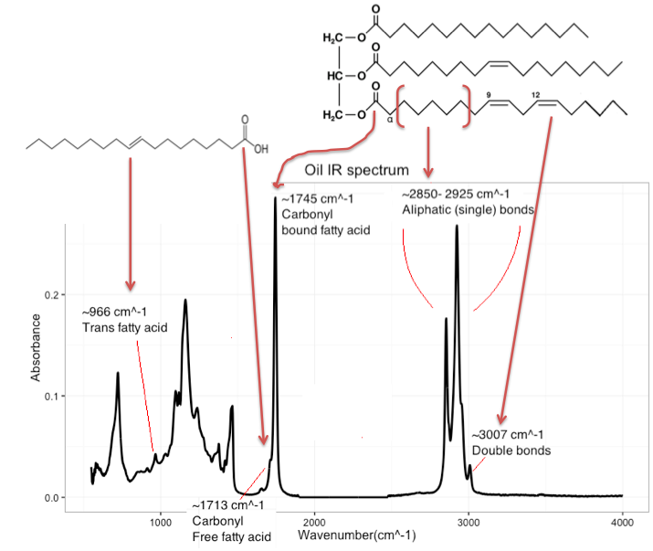{#fig-oil}::: {.callout-task}1. Load the "oliveoil" dataset in R. To be able to plot the raw spectral data, run the following R code. Use the `dim()` command to understand the difference between input and output to `melt()` on how the data is organised in the two formats.:::```{r}#| eval: falselibrary(reshape2)# Melt before plottingfor_raw <-melt(Oliveoil, id.vars =c("sample_id", "oliveoil", "thistleoil", "transfat"))# Define correct x-axis with wavelength vectorfor_raw$wl <-sort(rep(wl, nrow(Oliveoil)))```::: {.callout-task}2. Now make a plot of the raw data. Use the R-code below as a base, and customize it to your liking. Use the handy plotly package to plot an interactive plot that we can zoom in.:::```{r}#| eval: falselibrary(ggplot2)library(plotly)raw <-ggplot(for_raw, aes(wl, value, group = sample_id)) +geom_line()ggplotly(raw)```::: {.callout-task}3. Inspect the raw data plot. a. How does the raw data look? Are there any outliers? in ggplotly you can identify specific samples by hovering the curser over them. a. Try to color according to the different types of oil, one at a time. Then, zoom in on some of the peaks highlighted in @fig-oil. Can you observe a correlation between these peaks and the oil concentration?4. Now that you have a feel for the raw data, try to estimate the scores and loadings for a PCA model. Why do we only center, and not autoscale the spectral data?:::```{r}#| eval: false# Define PCAoliveoil_pca <-prcomp(Oliveoil[1:1790], center = T, scale = F)scores <-data.frame(oliveoil_pca$x)loads <-data.frame(oliveoil_pca$rotation)```::: {.callout-task}5. Using `ggplot()` and `ggplotly()`, make a plot of the PC1 vs PC2 scores, and color according to oliveoil content.6. Make two separate loading plots with first PC1 loads vs the wavelength (wl) vector and then PC2 loads vs. the wavelength. It is very important that the loadings are plotted separately, and not against each other when working with spectral data. Can you see why?7. Inspect the scoreplot. Are there any outlying samples? If so, identify them. Did you notice this outlier in the raw spectra plot? Remove the outlier by using the code below and inserting the correct sample id number.:::```{r}#| eval: false# Remove outlierOliveoil <- Oliveoil[-c(" insert outlier ID number here"), ]```::: {.callout-task}8. Now rerun your whole script and see how the removal of the outlier has changed the score and loading plots.9. Using the score plot, try to colour them by different oil types and elucidate what information about the samples is being described by the first and second PCA component, respectively.10. Inspect the loading plots and compare them to the information in @fig-oil. Can you re-find some of the important peaks in the loadings? And how does this relate to the findings in the scoreplot?. a. Hint: Remember that the dataset is mean centred, so the peaks will be positive or negative. Negative scores have a high absorbance in the negative loading ”peaks”, and positive scores have a high absorbance in the positive loading ”peaks”.:::::::::